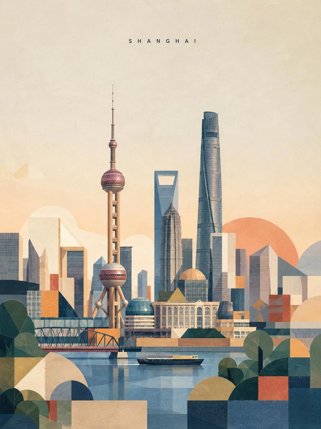


images · travel poster · editorial print
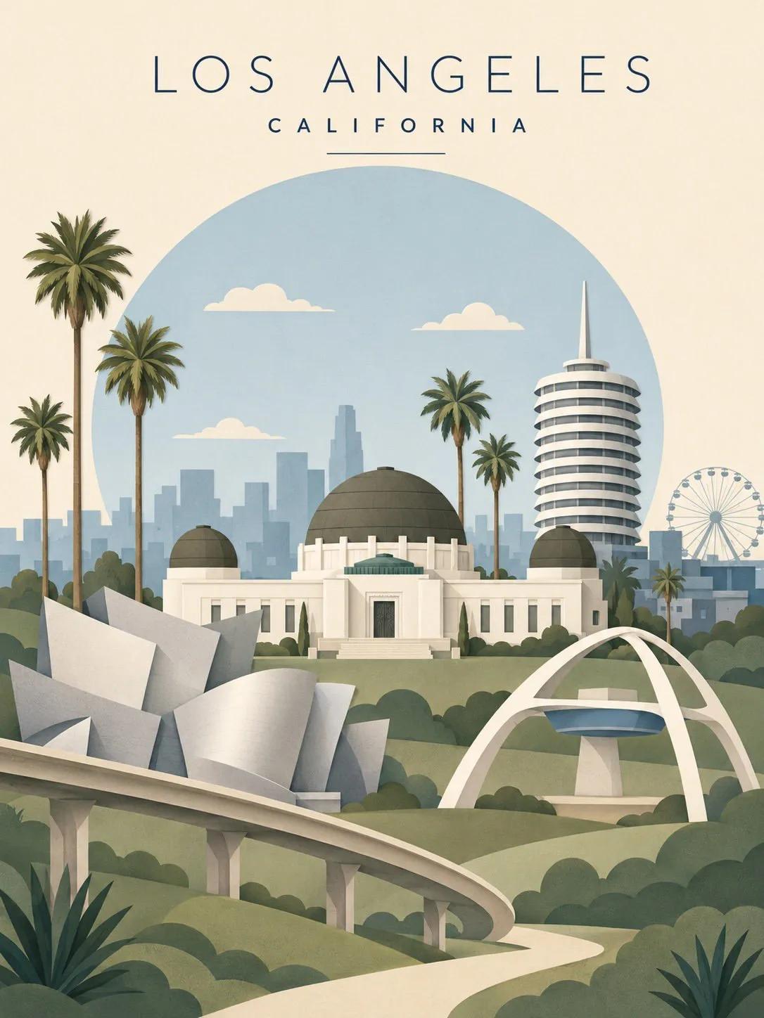
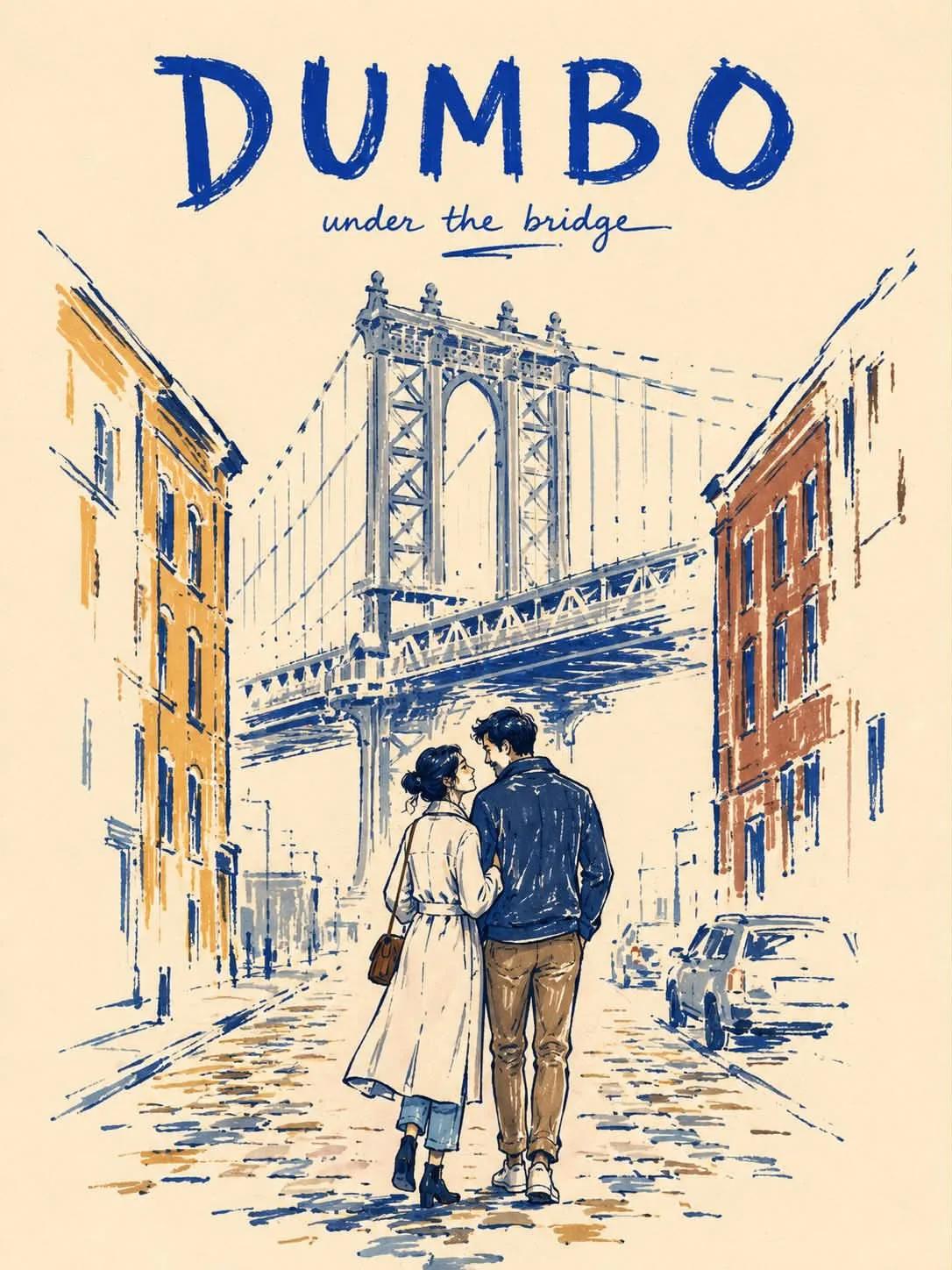
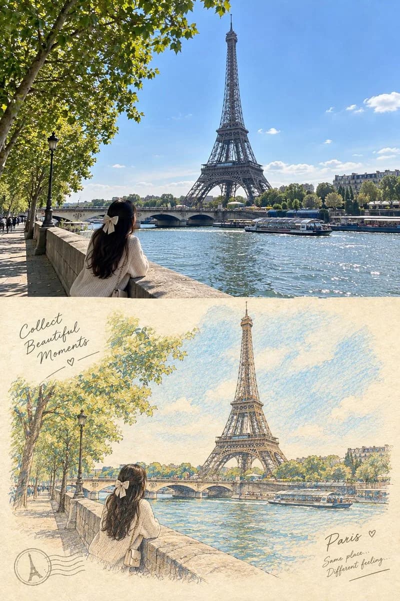
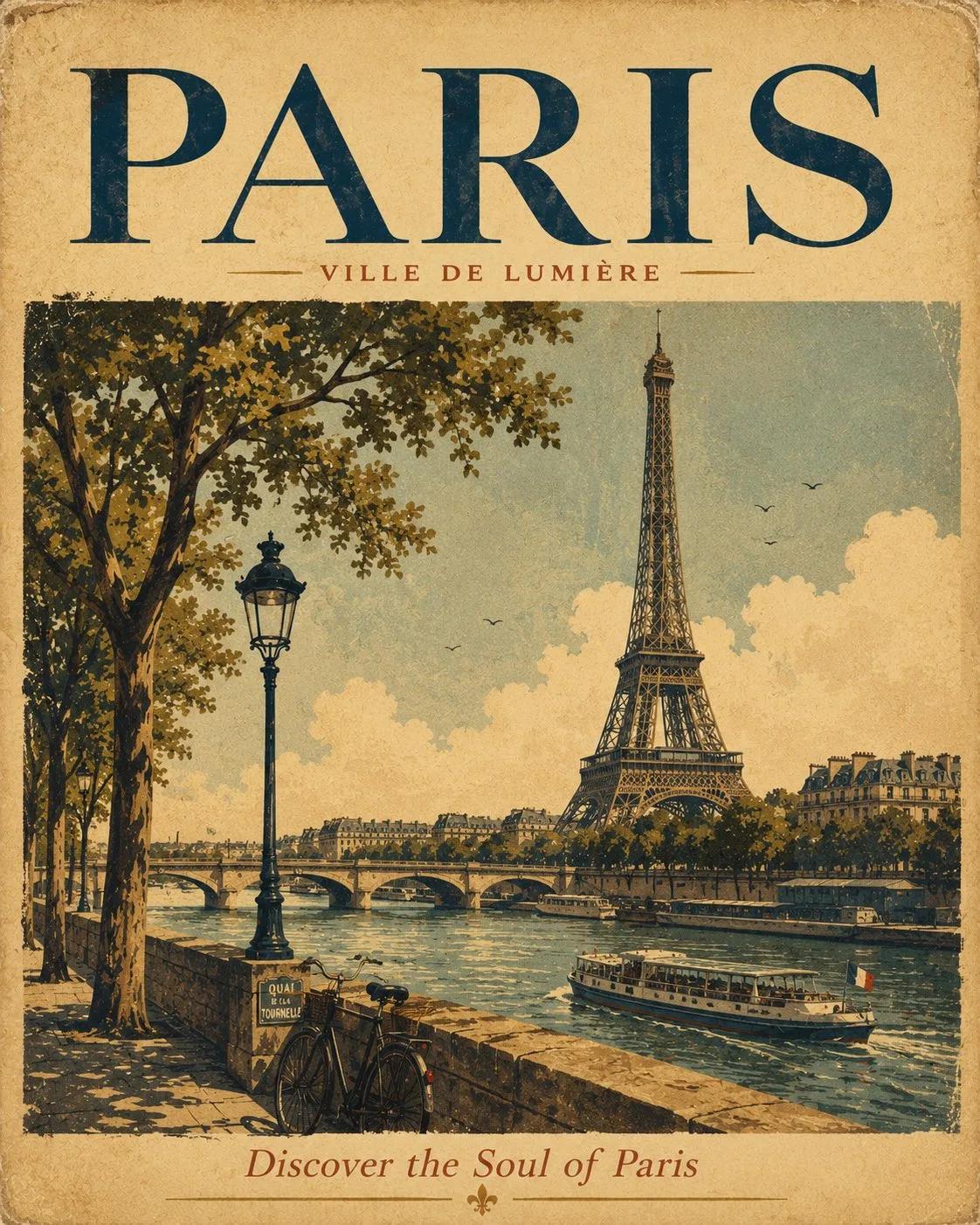
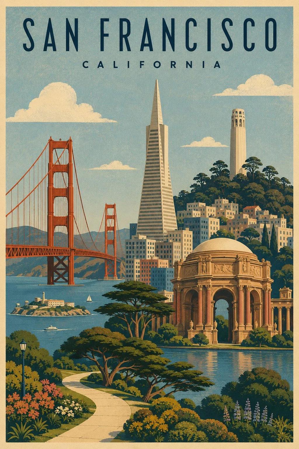
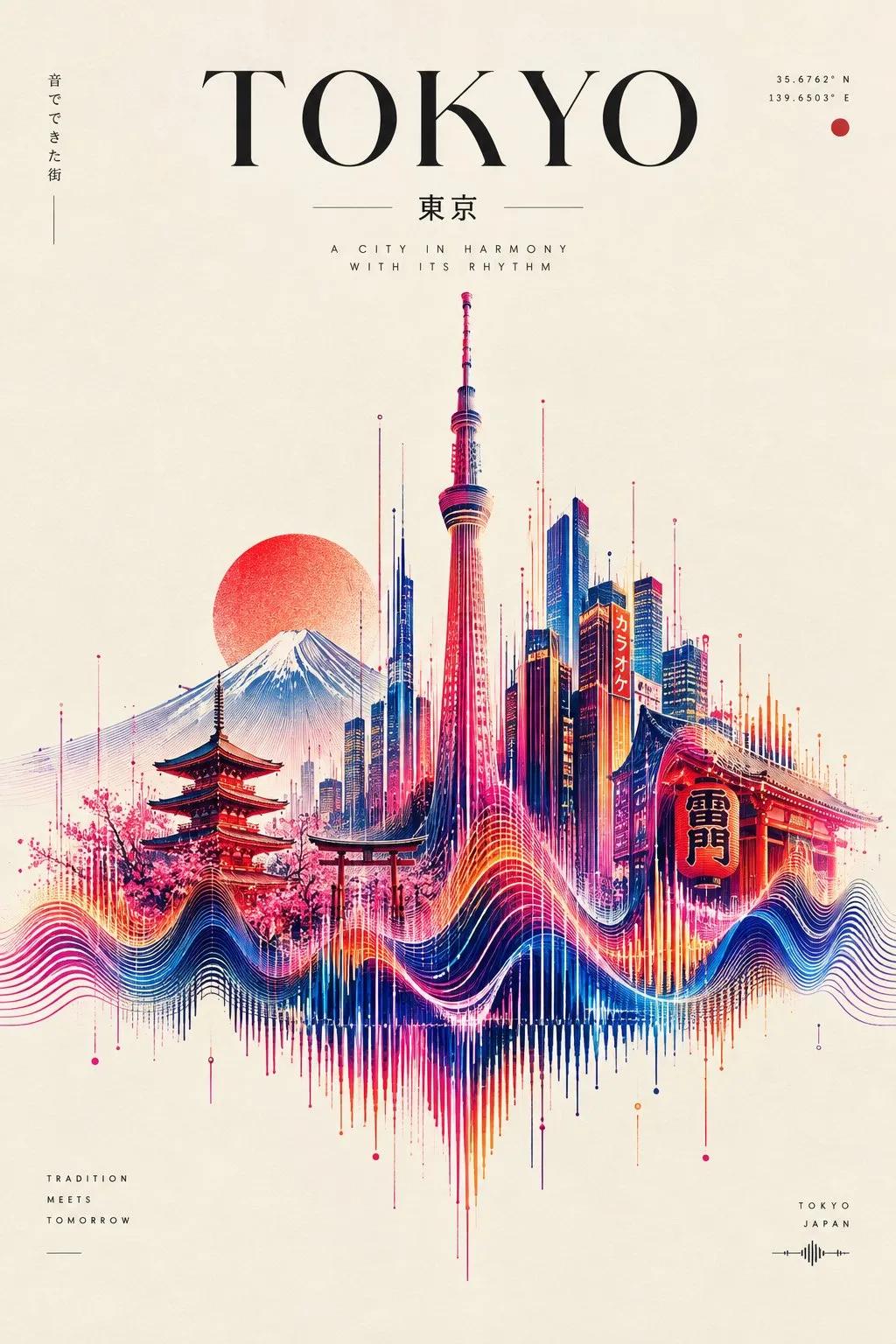
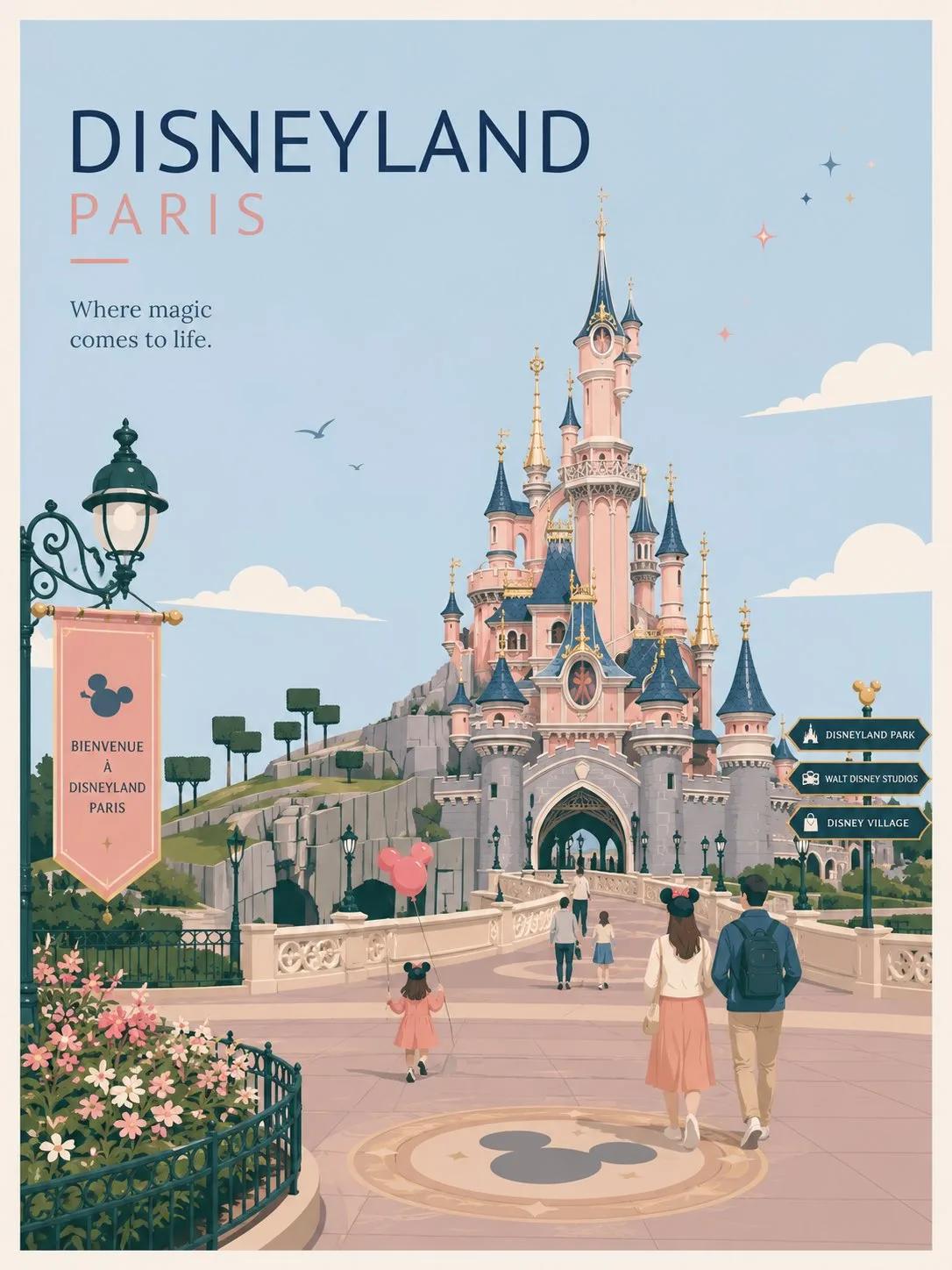
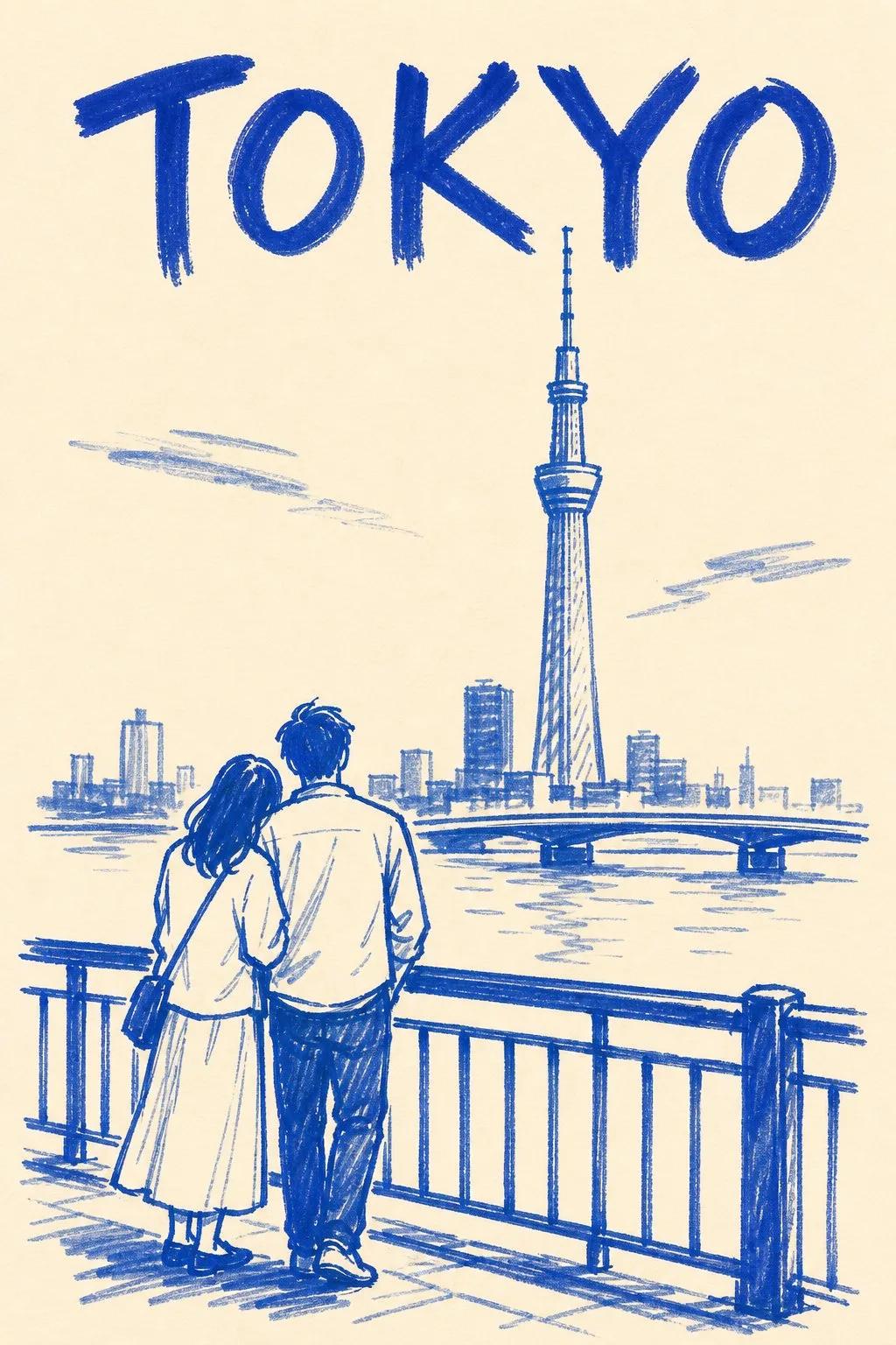
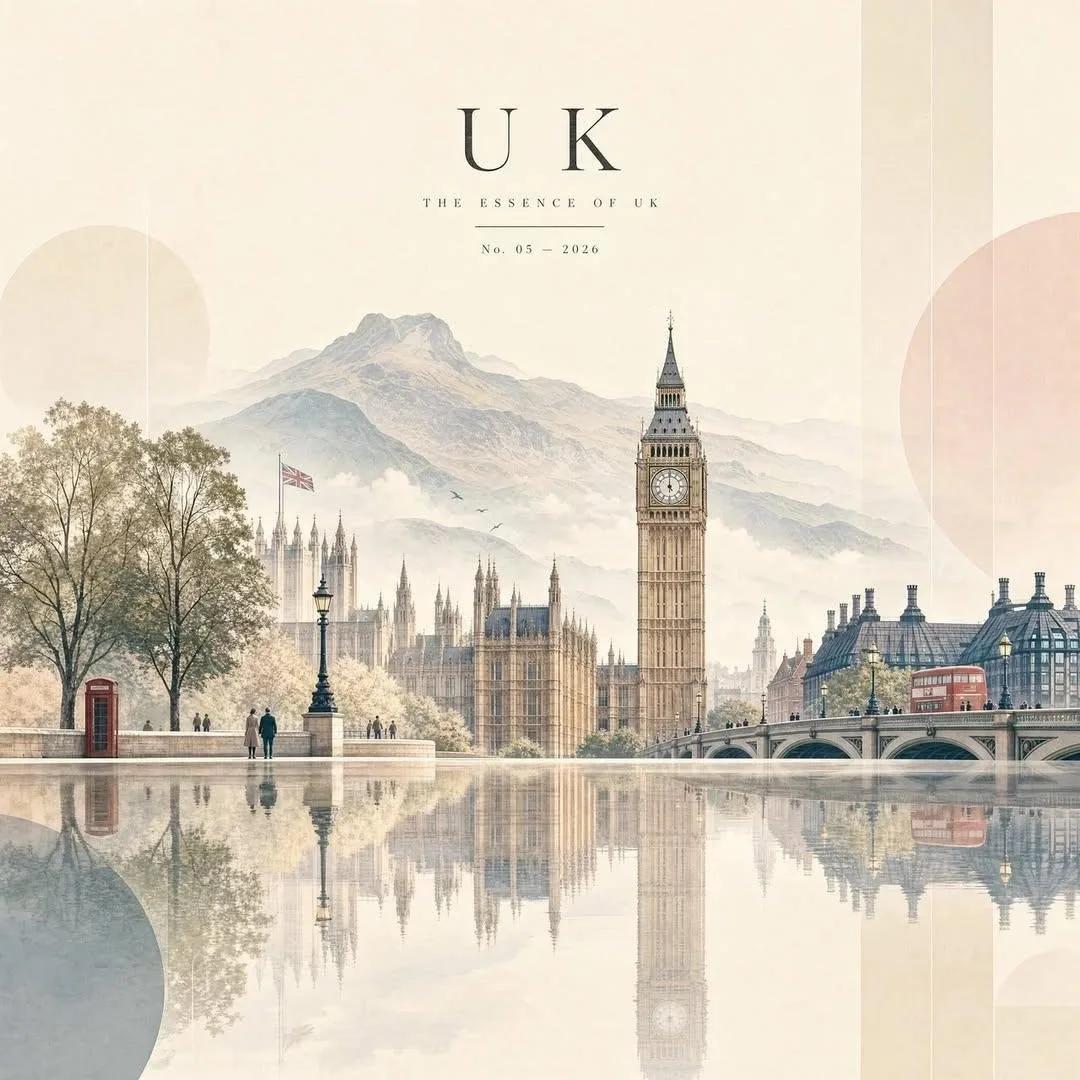
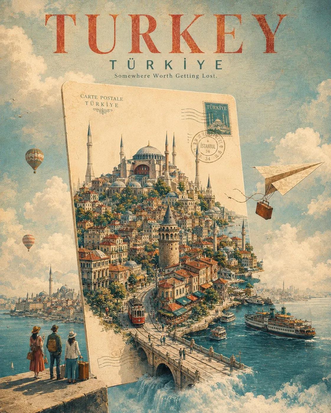
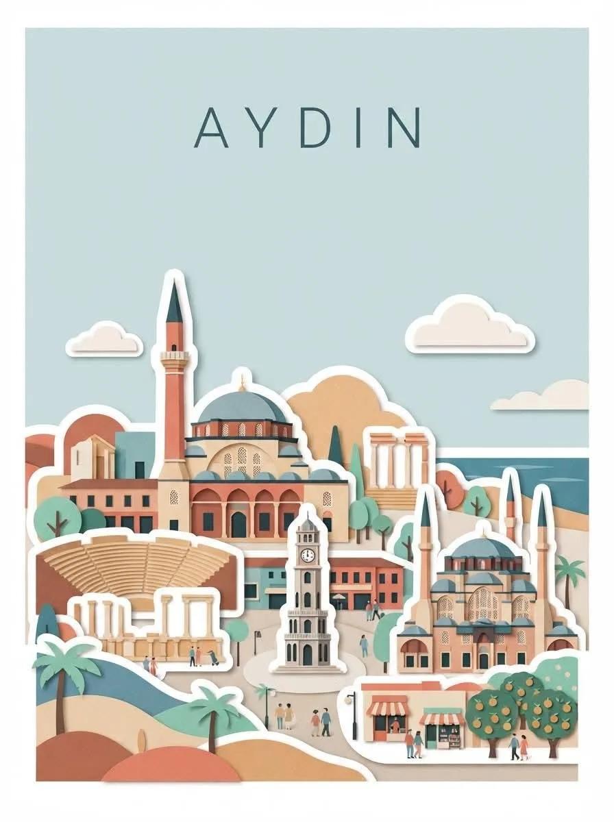
Create a sophisticated vertical 3:4 travel art poster featuring [DESTINATION], designed as a refined contemporary fine-art print. CORE CONCEPT LANDMARK 70% + GEOMETRIC ABSTRACTION 30% Clearly depict the destination's most iconic landmarks, architecture, and landscapes first. Apply geometric simplification only after establishing a strong, recognizable destination identity. The viewer should immediately think: "This is [DESTINATION]." LANDMARKS Select 3–5 iconic visual elements, with 1–2 as the main protagonists. Preserve the primary landmarks' recognizable: Silhouettes, proportions, architectural features, distinctive details. Keep landmarks visually dominant. Do not reduce them into generic circles, rectangles, or abstract shapes. GEOMETRIC ABSTRACTION Use geometry as a supporting design language rather than replacing the landmarks. Use circles, arches, rectangles, triangles, stepped forms, simplified rooftops, and layered color fields. Apply these mainly to secondary architecture, roads, rivers, hills, trees, background skylines, and negative spaces. Maintain the visual balance of approximately 70% recognizable destination imagery + 30% geometric abstraction. COMPOSITION Use a stable, elegant 3:4 vertical composition with generous negative space. Keep approximately the upper 40–50% open and atmospheric. Place only [DESTINATION] at the upper center using small uppercase English typography, thin sans-serif lettering, and wide letter spacing. No slogan, subtitle, or additional text. Build the main cityscape or landscape in the lower portion, making the primary landmark the first visual focus. Surround it naturally with secondary architecture, vegetation, water, hills, bridges, or other destination-specific elements. VISUAL HIERARCHY Primary landmark → cityscape/overall silhouette → regional architecture → natural environment → geometric decoration. Do not simplify every element equally. Primary landmarks should remain specific and recognizable, while surrounding elements can become progressively more geometric. COLOR & TEXTURE Use a sophisticated 6–10 color palette inspired by [DESTINATION], with muted contemporary tones and enough contrast to separate landmarks from their surroundings. Aim for the feeling of a museum-quality gouache artwork / contemporary editorial print. Add subtle handmade texture through paper fibers, gouache pigment variation, dry brush, colored pencil, pastel, or silkscreen-like texture. Keep it clean and contemporary. Avoid aged paper, sepia, yellowed backgrounds, or vintage brown filters. STYLE Scandinavian editorial illustration, mid-century geometric art, contemporary travel poster, modern architectural illustration, fine-art print, gouache and colored-pencil texture, restrained geometric simplification. AVOID Extreme abstraction, generic geometric cityscapes, giant circles or blocks dominating the composition, excessive Bauhaus abstraction, photorealism, 3D rendering, cartoon characters, sticker aesthetics, neon colors, excessive gradients, dramatic shadows, gold decoration, excessive architectural detail, overcrowding, or complex typography. FINAL TEST The destination must be recognizable within the first second, while closer inspection should reveal a sophisticated contemporary artwork rather than a conventional tourism poster. Mood: airy, recognizable, architectural, poetic, refined, geometric, sophisticated, contemporary, and collectible. Generate for istanbul.
Related prompts