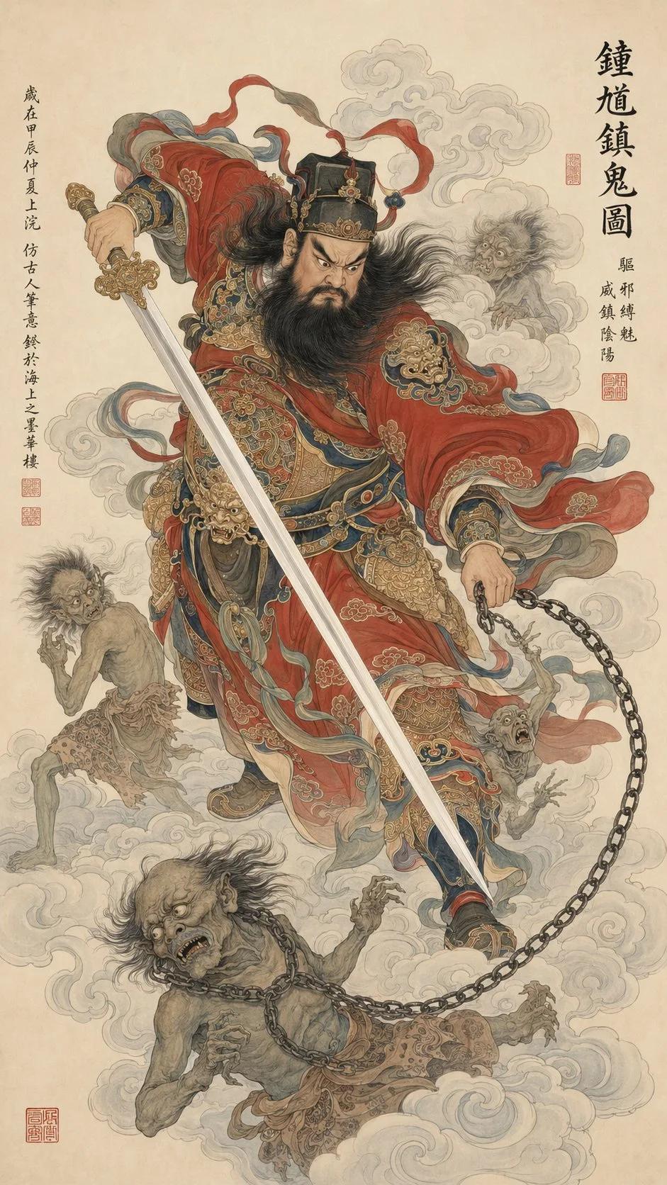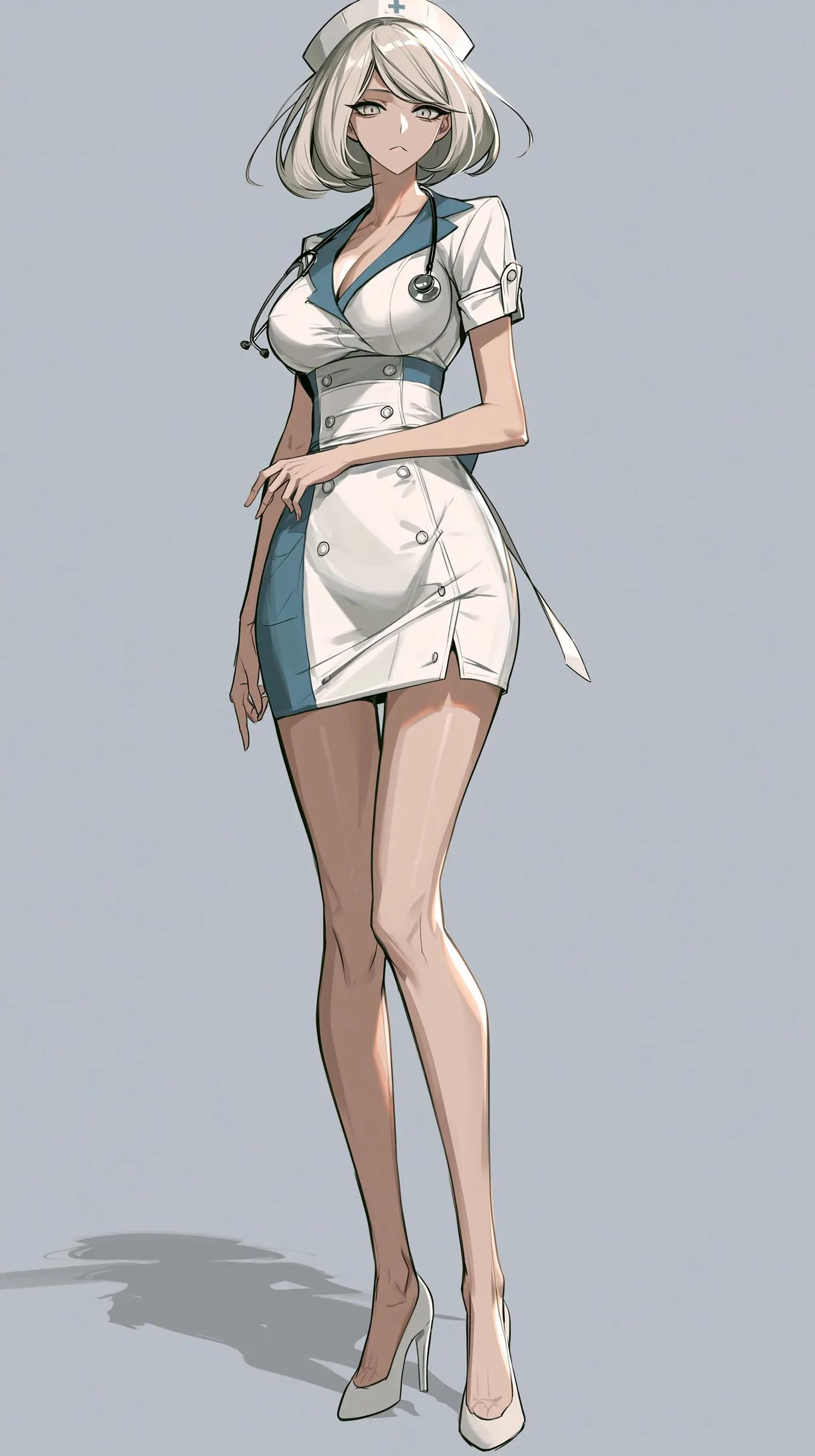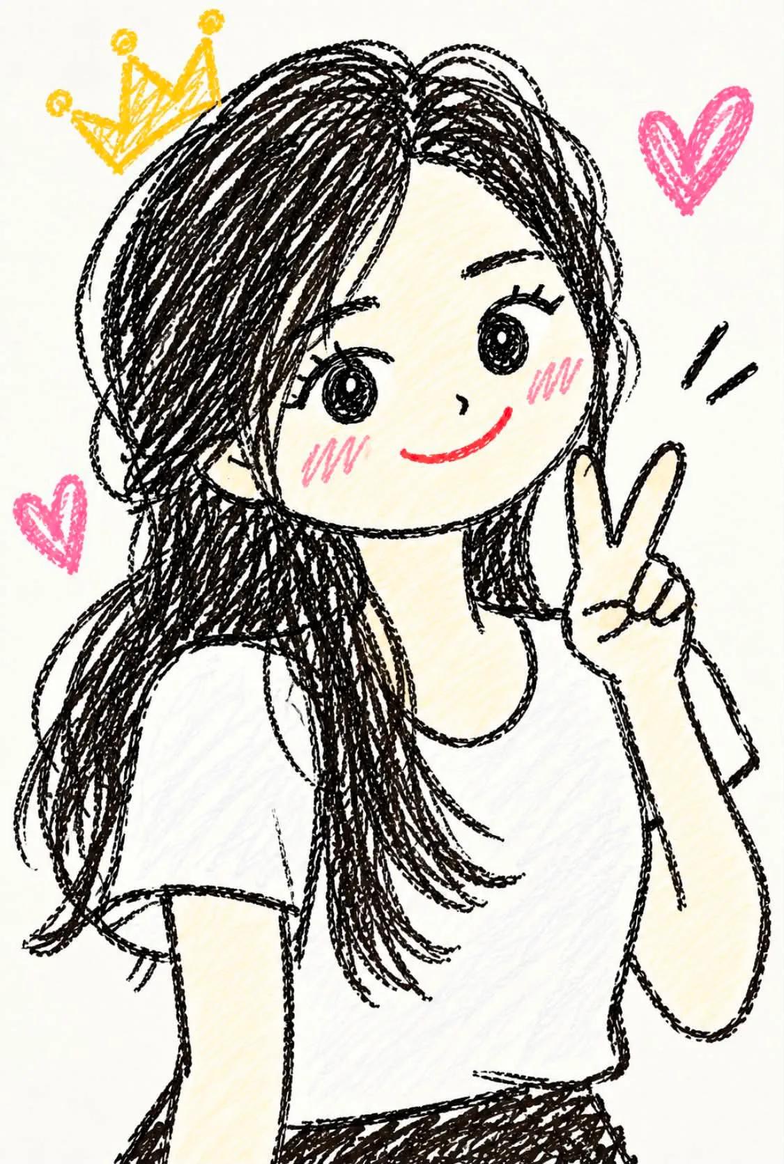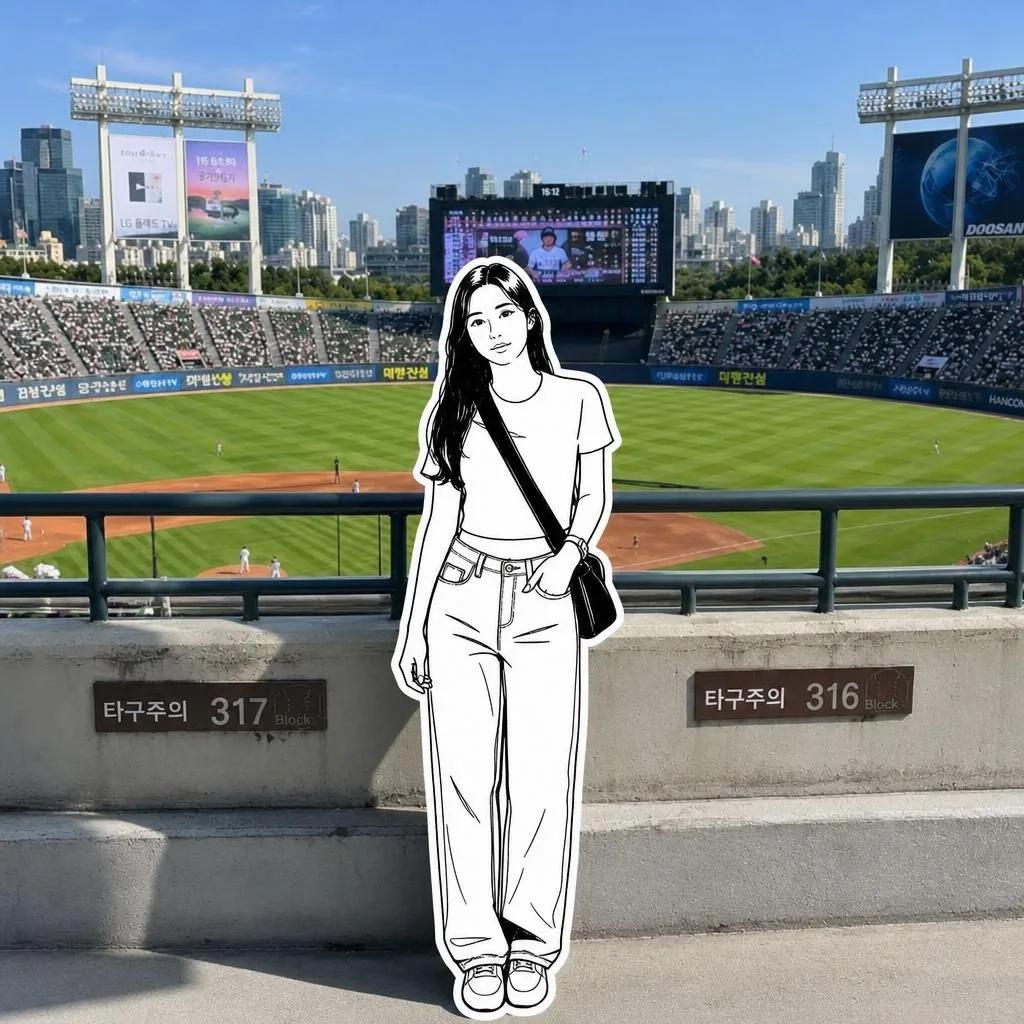


images · editorial cover · art-book design
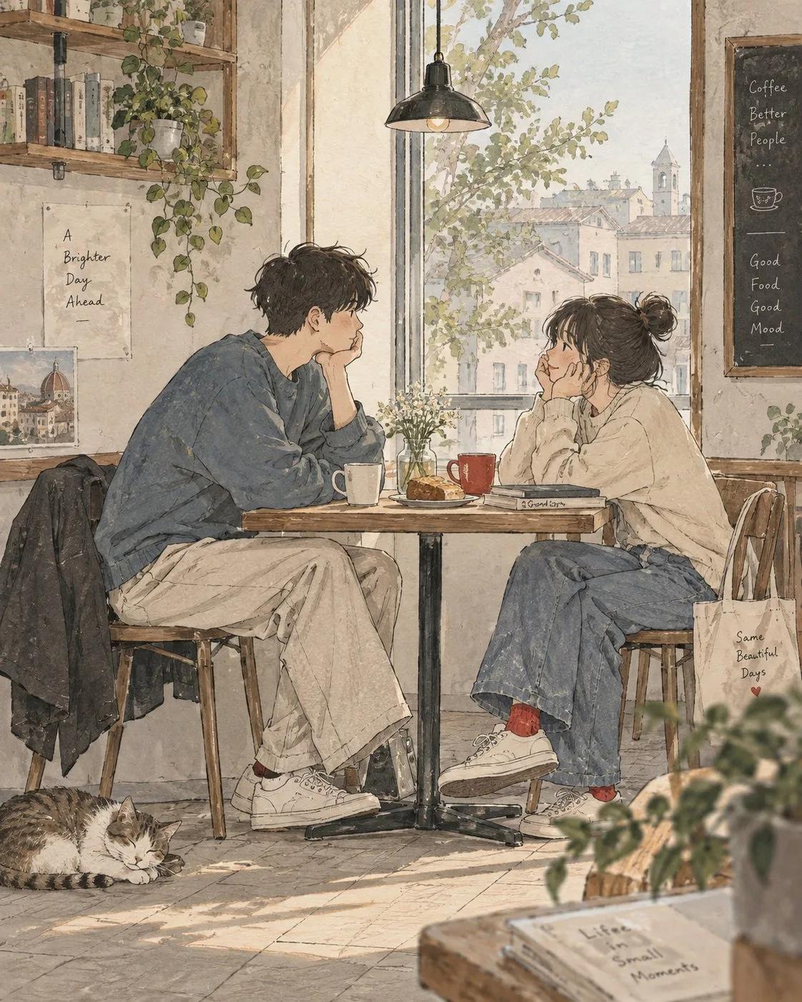
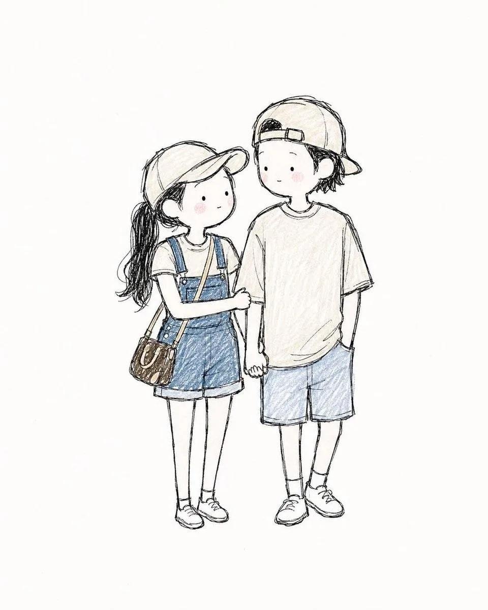
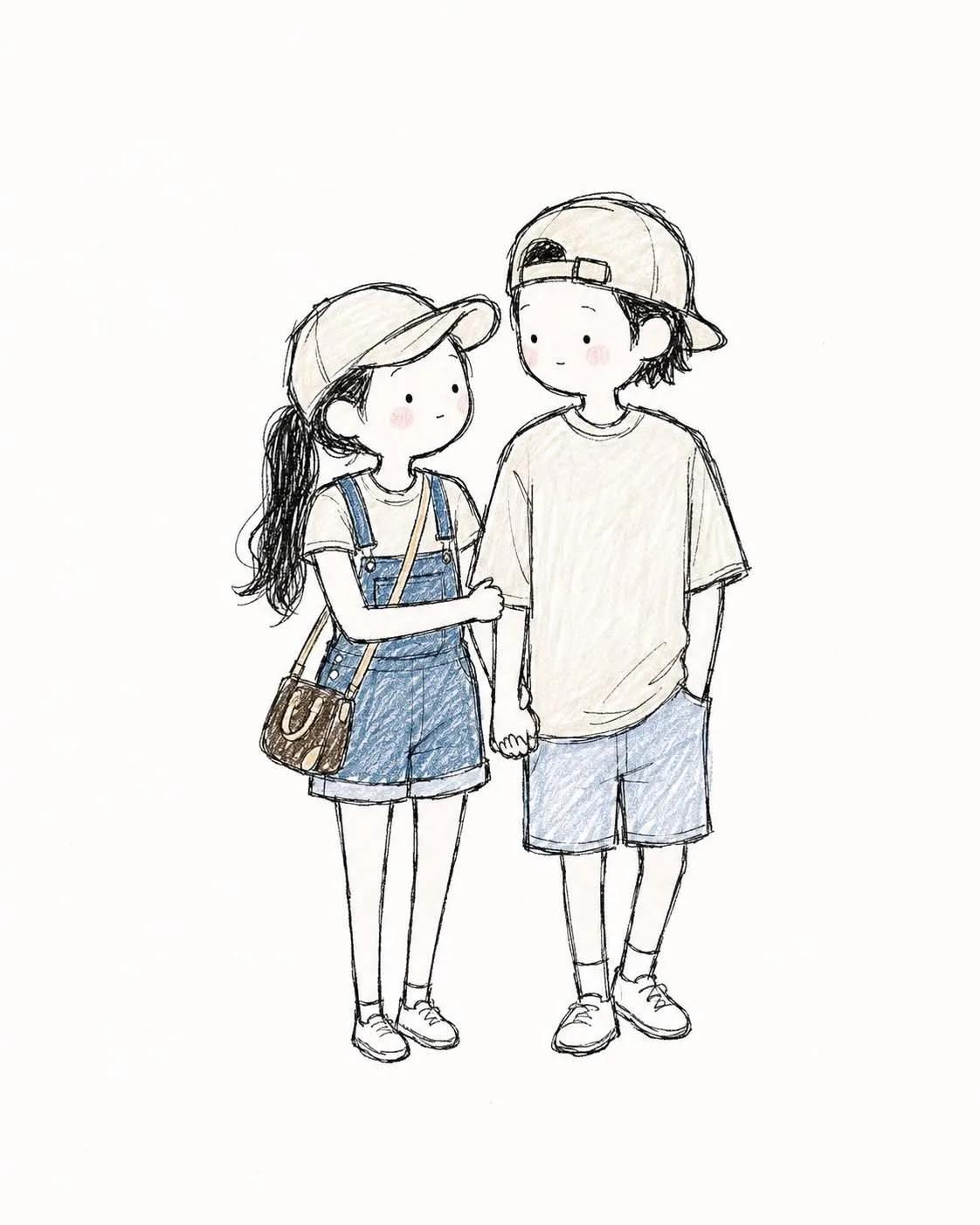
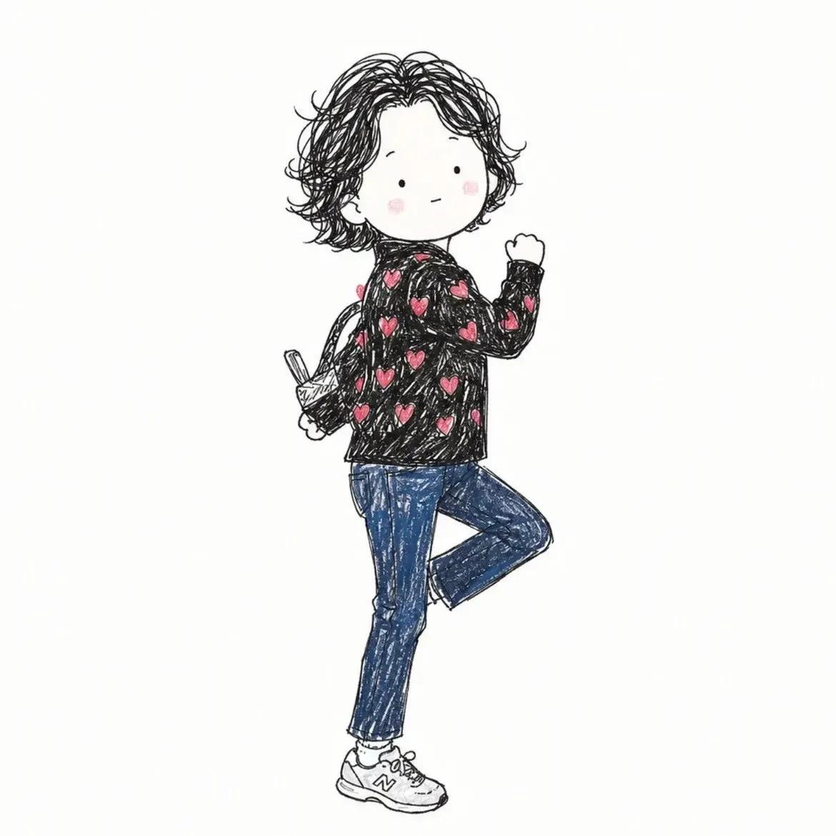
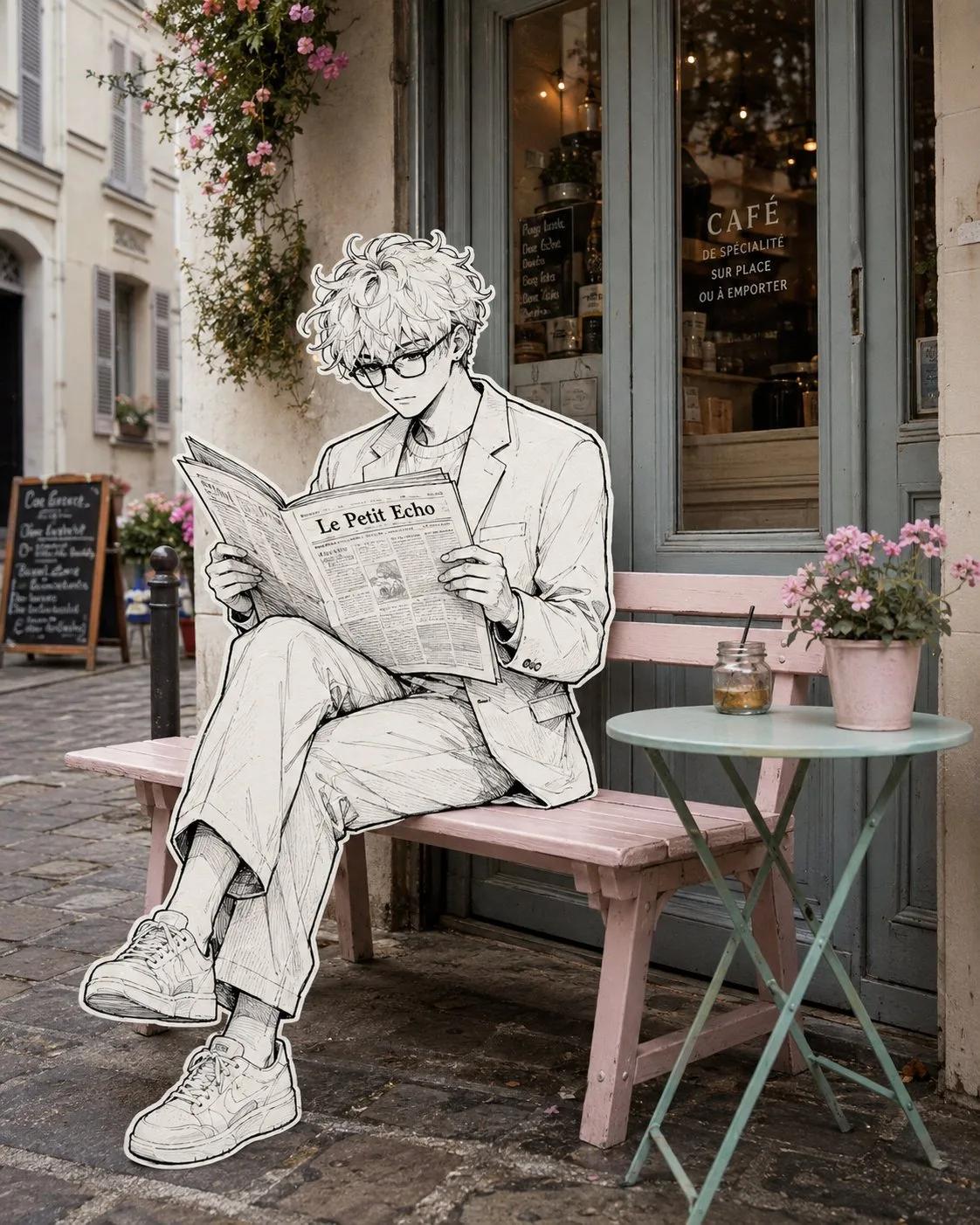
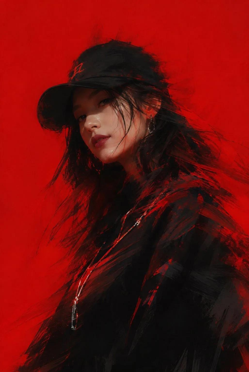
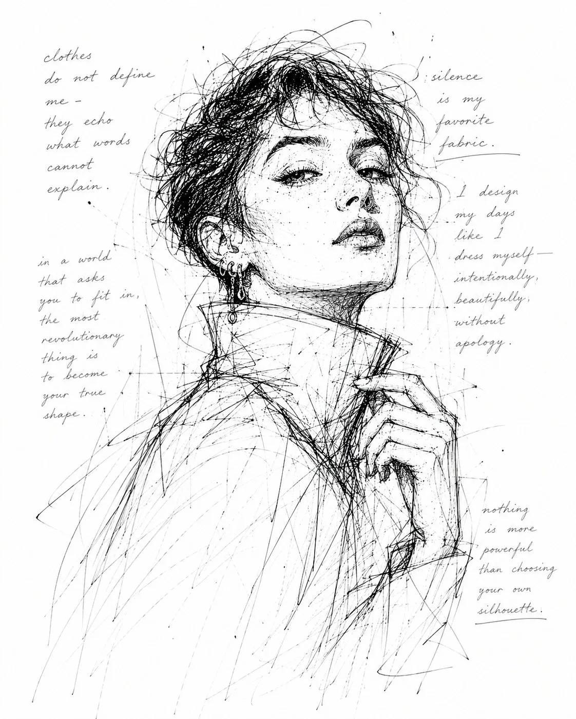
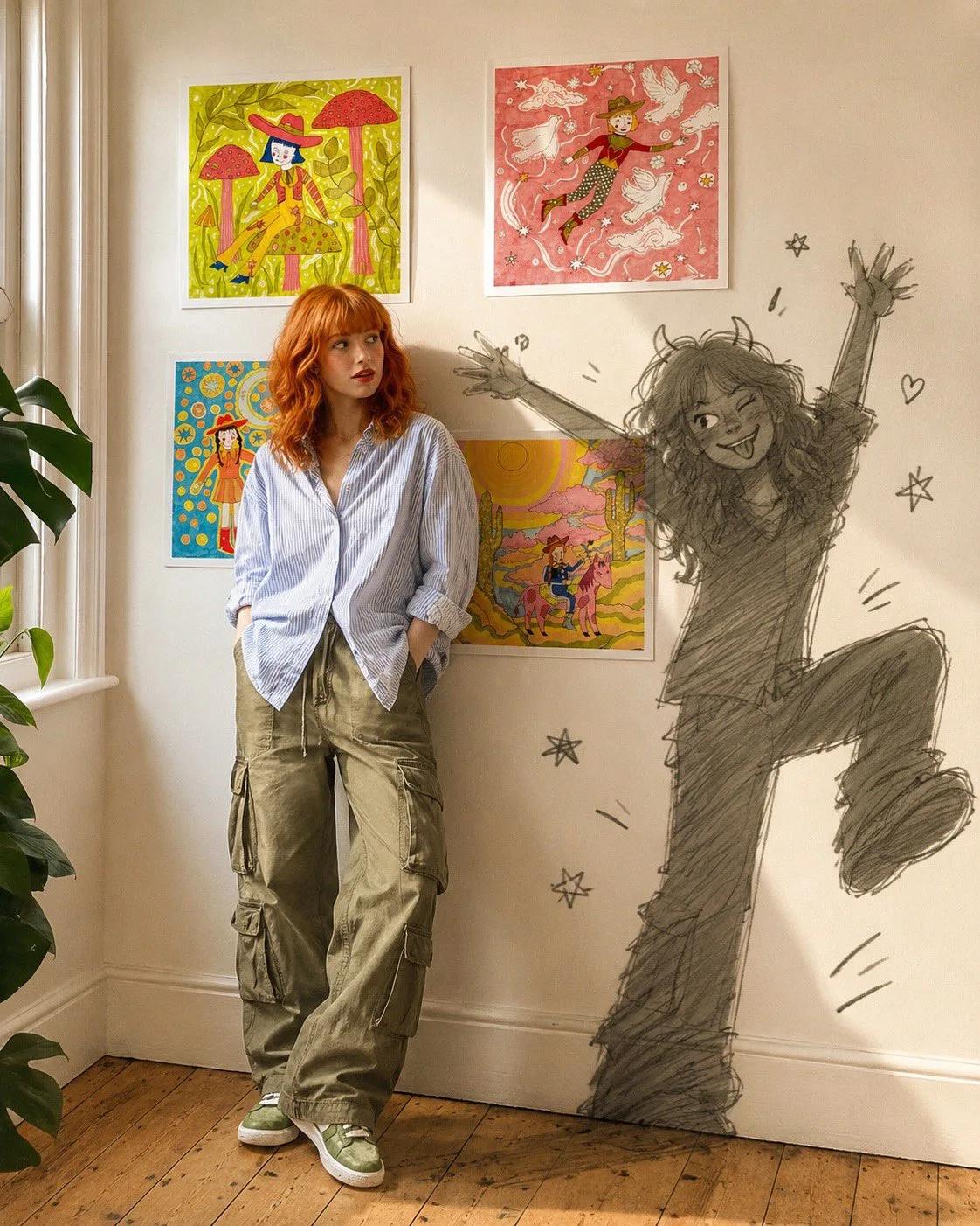
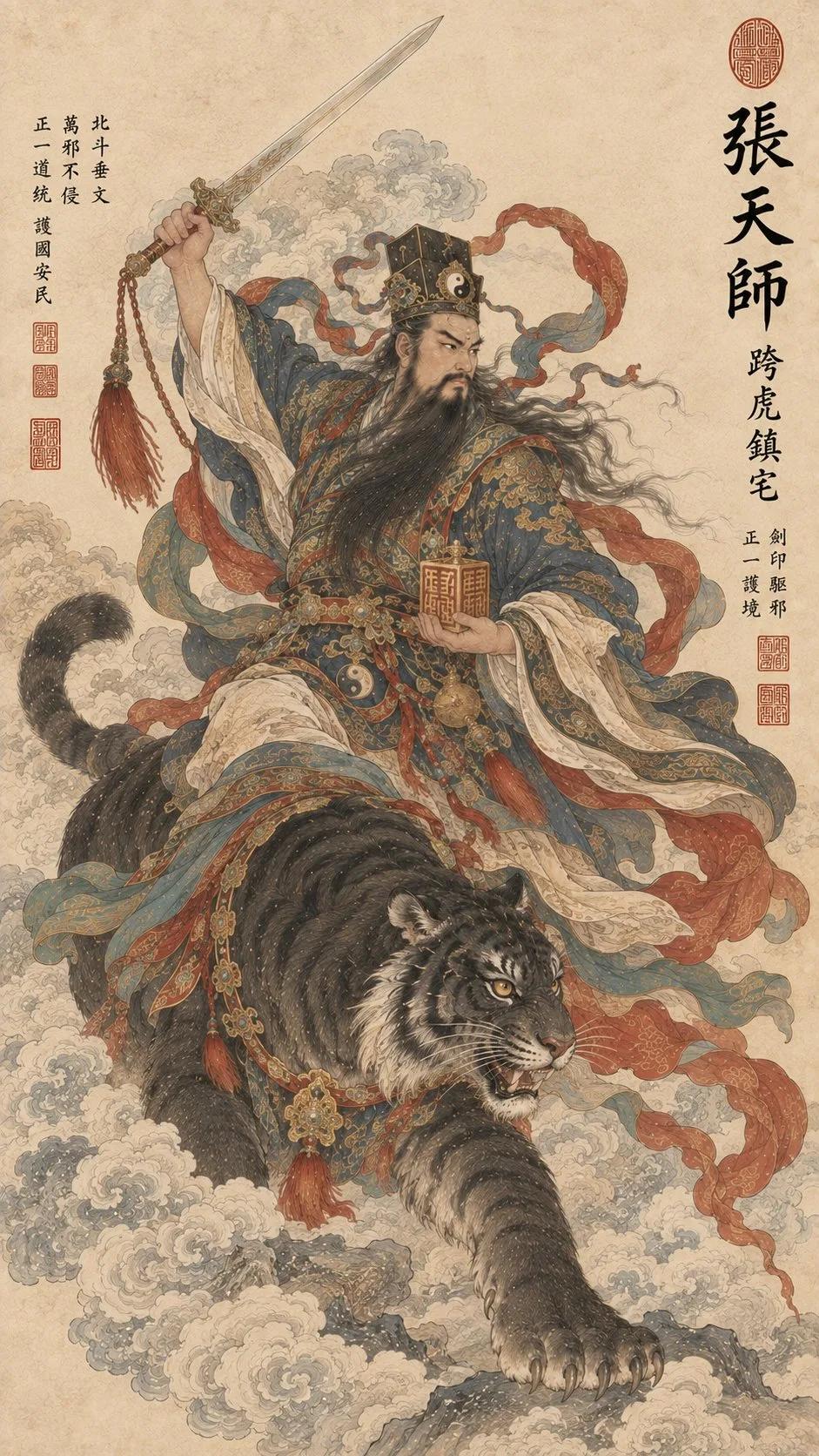
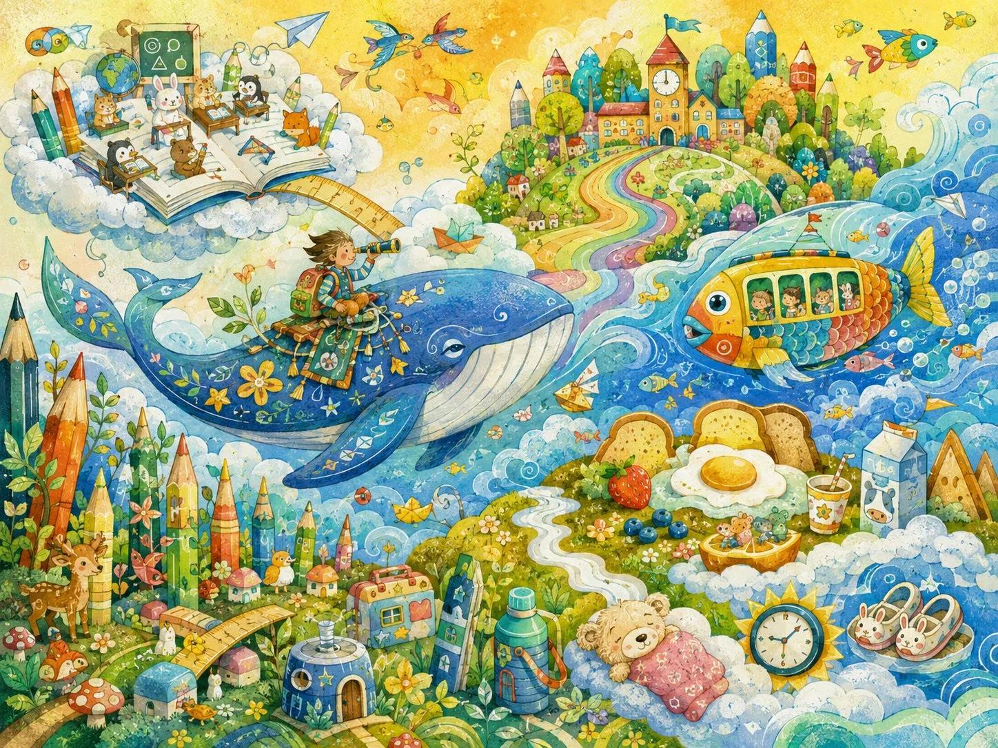
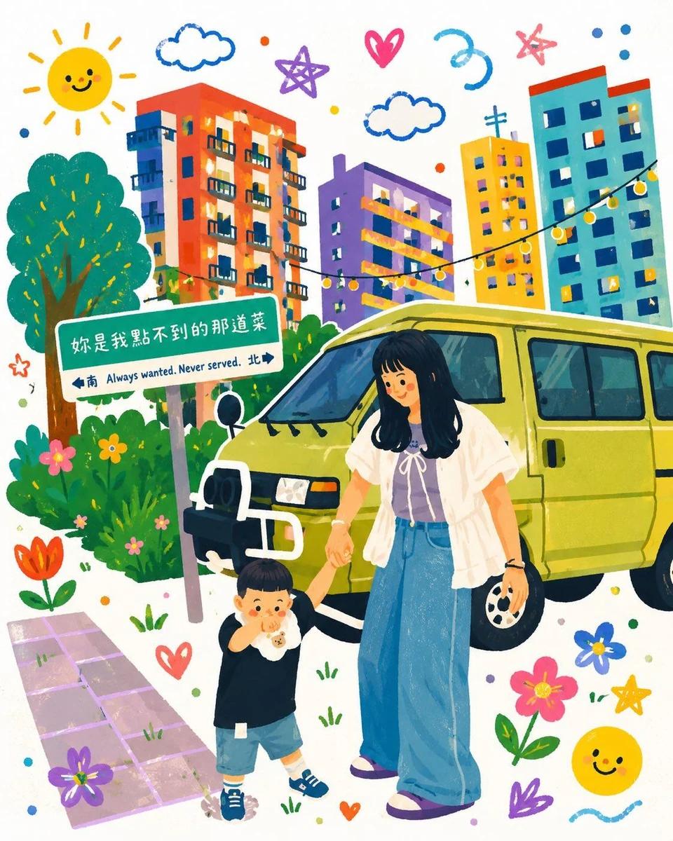
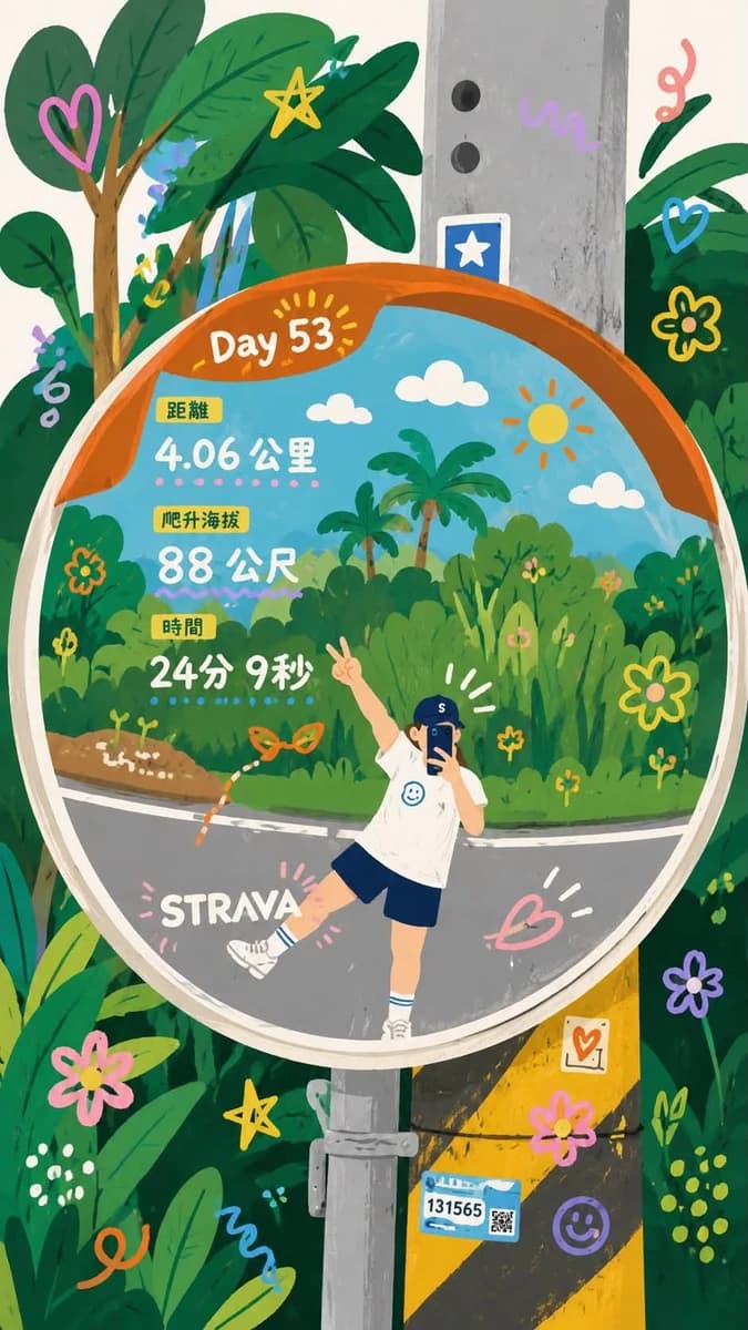
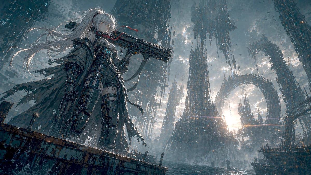
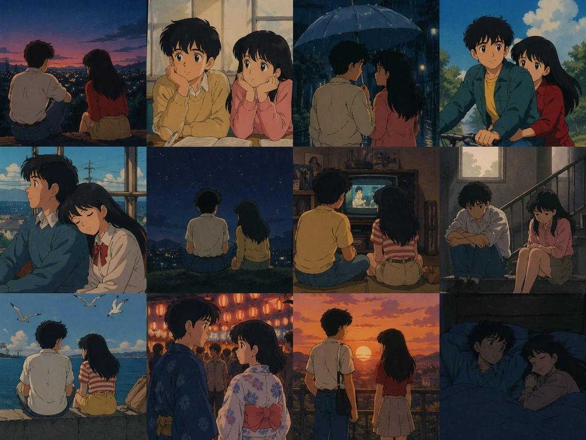
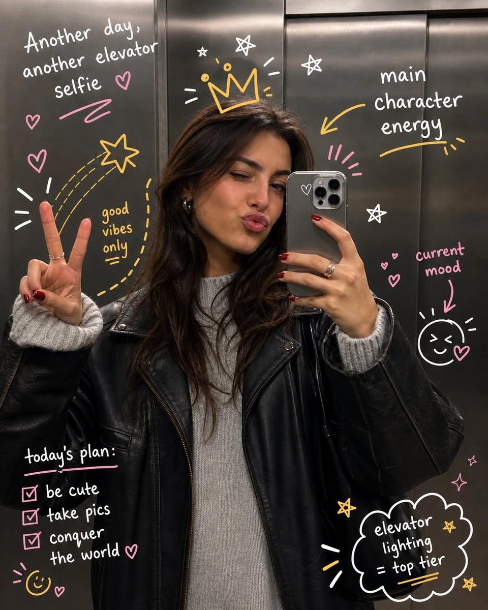
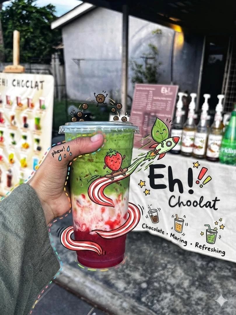
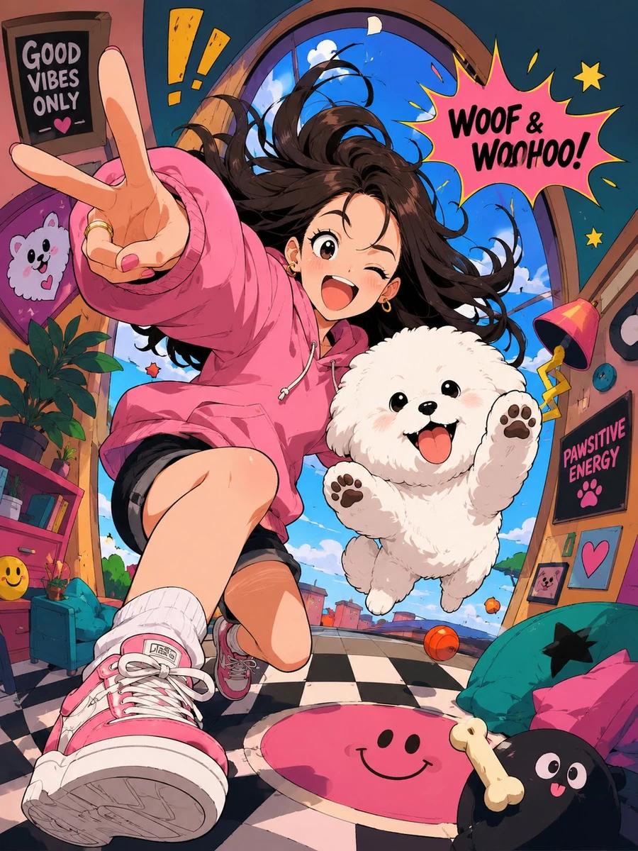
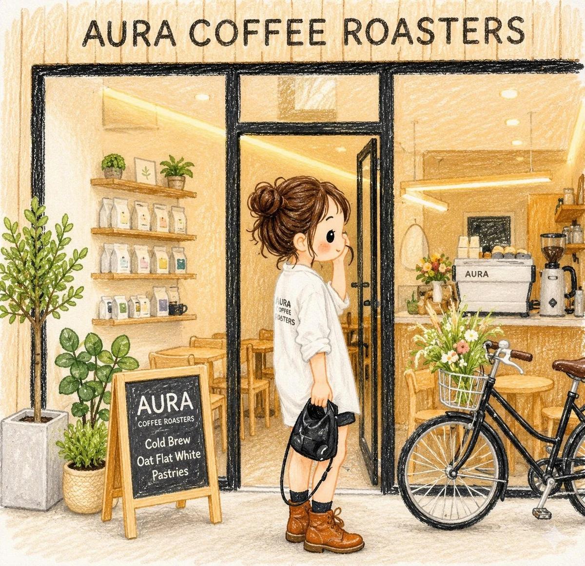
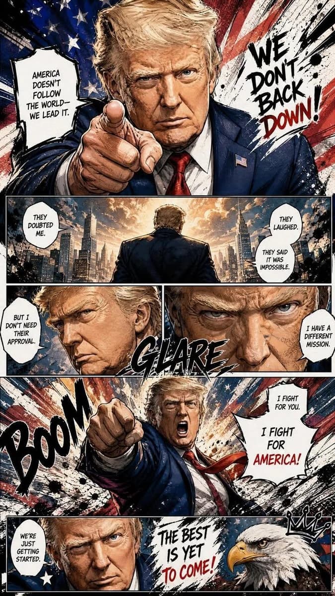
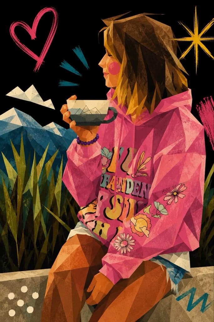
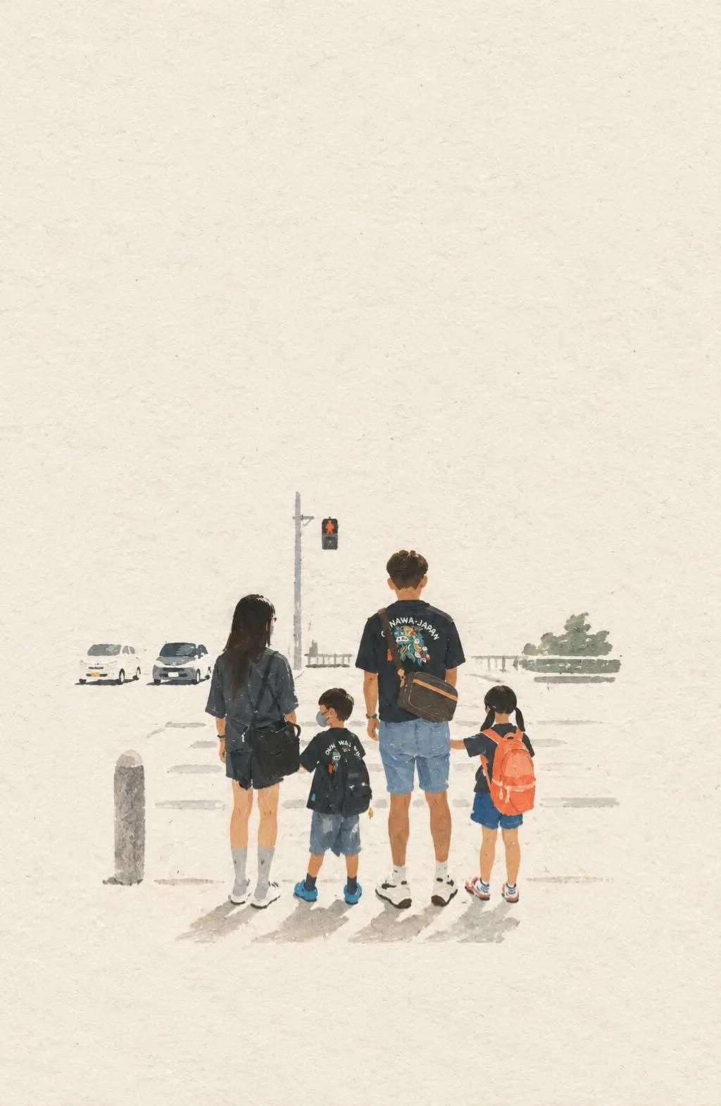
Transform the uploaded photo into a minimalist, hand-drawn, paper-textured artistic cover. Position the main subject near the bottom center, occupying only 10–20% of the frame, and leave generous negative space throughout the image. Suggest the environment using only a few lines or small blocks of color. Preserve the subject’s most recognizable features, essential silhouette and proportions, original pose or primary action, important objects, defining details, core story, relationships, and emotional atmosphere. Extract the dominant colors from the original photograph and limit the palette to no more than four main colors. Use bold yet restrained, flat color blocks in a harmonious, muted combination, with subtle paper grain and handmade brush textures. Remove unnecessary details and visual clutter, retaining only the essential visual information needed to make the subject instantly recognizable. Optionally incorporate a small amount of simple, short, subtle, aesthetically refined text that integrates naturally into the composition; omit typography if it does not improve the composition. Aim for the visual language of an art-book cover, independent publishing, modern editorial design, or a contemplative picture book. Use delicate, slightly imperfect hand-drawn lines, a few clearly defined acrylic-like flat color blocks, rough tactile paper texture, visible handmade brushstrokes, organic irregular natural contours, and subtle imperfections that make the artwork feel genuinely handmade. The overall mood should be quiet, poetic, sophisticated, minimalist, innocent, relaxed, artistic, thoughtful, distinctive, and premium. Avoid colored-pencil rendering, dry-brush effects, watercolor washes or bleeding, pure line-art illustration, overly detailed or realistic illustration, heavy impasto or thick oil-paint textures, smooth polished digital illustration, 3D rendering, glossy surfaces, artificial lighting effects, generic commercial cartoon styles, e-commerce advertising aesthetics, generic poster templates, excessive decorative elements, overly complex compositions, and too much text. Final result: a refined, minimalist, hand-crafted paper illustration with generous negative space, restrained colors, subtle tactile textures, and the sophistication of an independent art-book cover.
Related prompts