

images · editorial cover design · title card series
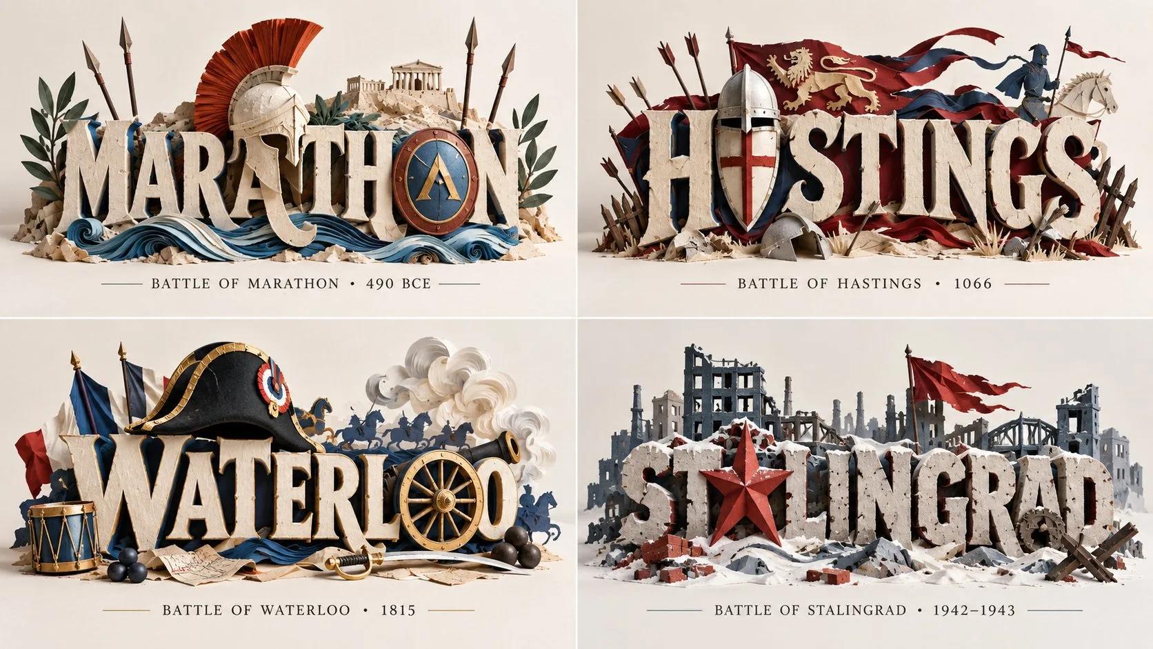
2x2 grid, 16:9. For 4 battles that changed history. P₁ PAPER‑MEDIUM TITLE (master): the title letters are physical paper constructions (cut/layered, quilled coils, origami facets, brush‑cut strips) with visible thickness, cut edges and cast shadows. Not flat digital type, vector logo, or non‑paper physicality. P₂ ICON‑IN‑SAME‑MEDIUM INTEGRATION: the series' iconic emblem/character is built in the same paper medium and woven into the wordmark (replaces a letter, interlocks as a neighbor, or frames the word); instantly recognizable. Not a flat graphic icon, icon in a different medium, absent icon, or unrecognizable icon. P₃ MEDIUM‑CONSISTENT PROPS + LIMITED ACCENTS: small paper props from the series world (rope, katana, stamp, clouds, triangles) plus a limited accent palette of no more than two hues beyond black/cream/white. No foreign‑material props, rainbow palette, or missing props. P₄ PHYSICALITY + STUDIO LIGHT: real cast shadows, paper thickness and edge highlights, slight lift or curl; a photographed paper sculpture on an off‑white ground. Not a flat scan, no shadows, floating without contact, or busy background. P₅ LEGIBILITY + COMPOSITION: the title stays legible despite the integration; balanced composition; clean off‑white ground. Not illegible, cluttered, or dark background. HONEST PAPER fiber texture, cut edges, coil ends, fold creases, and shadow softness. Forbidden: flat digital type, vector logo, icon in different medium, unrecognizable icon, foreign‑material props, rainbow palette, no shadows, busy background, illegible title.
Related prompts