

images · campaign poster · OOH advertising
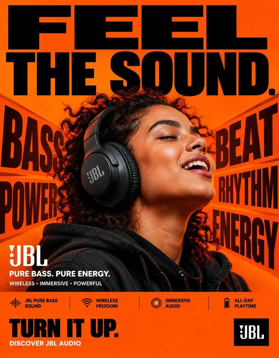
JBL — “FEEL THE SOUND.” FORMAT: 4:5 vertical hyper-commercial JBL headphone campaign poster, ultra-high-resolution 8K, global OOH + Instagram + Meta advertising, BOLD TYPOGRAPHY–FIRST DESIGN, aggressive editorial graphic design, premium product photography, contemporary JBL advertising language. CORE IDEA: FEEL THE SOUND. Make typography the dominant visual element, with JBL’s signature orange brand color controlling the entire visual environment. The poster communicates powerful JBL audio through a physical graphic metaphor: SOUND → IMPACT → MOVEMENT. The typography reacts to the sound, creating a visual sense of bass, rhythm and energy. MASTER COMPOSITION: Highly graphic, typography-dominated composition. TOP 40% — TYPOGRAPHY DOMINATION. Massive stacked headline: FEEL THE SOUND. Extremely bold condensed sans-serif typography occupying almost the entire width of the poster. Aggressive scale, some letters cropped by the edges, typography feels physically pushed by sound pressure. BRAND-COLOR BACKGROUND: JBL’s signature orange as the dominant full-frame background. Strong, saturated JBL orange with subtle tonal variations: deep orange shadows, bright orange highlights, slight darker orange graphic blocks, black typography, white microcopy. PRODUCT + SUBJECT: A realistic person wearing a JBL headphone prominently in the center/lower-middle section. The headphone is highly recognizable and physically accurate. The subject is positioned within the typography composition, energetic and immersed in the music with a natural expression. No exaggerated fashion pose. The headphone is the product hero. TYPOGRAPHIC VISUAL METAPHOR: Oversized graphic words around the product — BASS, BEAT, POWER, RHYTHM, ENERGY — as huge background typography. Some letters stretch, overlap and partially disappear behind the subject. Typography creates the sensation of sound physically moving through the poster, with subtle directional typographic distortion around the headphone. No literal sound waves. No futuristic holograms. TYPOGRAPHY SYSTEM: Primary headline FEEL THE SOUND in extremely heavy bold grotesk/condensed sans-serif, huge scale, tight kerning, strong black against JBL orange. Secondary copy: JBL PURE BASS. PURE ENERGY. Microcopy: WIRELESS • IMMERSIVE • POWERFUL in small uppercase commercial typography. FEATURE STRIP: Bottom section with a highly structured commercial information bar — JBL PURE BASS SOUND, WIRELESS FREEDOM, IMMERSIVE AUDIO, ALL-DAY PLAYTIME — compact uppercase typography separated by thin black rules. CTA: Large bold TURN IT UP, with DISCOVER JBL AUDIO below. JBL logo positioned prominently but cleanly. COLOR SYSTEM: Primary JBL signature orange, secondary deep black, accent white. Orange dominates the background, black provides major typography contrast, white is reserved for small supporting information and selected graphic details. No unnecessary blue, purple, cyan or neon gradients. LIGHTING: High-end commercial product photography, strong directional studio lighting, controlled highlights on the headphones, natural skin texture, subtle orange environmental bounce light, deep controlled shadows, high contrast, product separates clearly from the orange background. HYPER DETAILING: Ultra-realistic headphone materials — precise matte and gloss surfaces, realistic ear cushions, detailed controls, subtle reflections, accurate JBL branding, realistic skin pores, natural clothing texture. Typography remains razor sharp and professionally typeset. COMPOSITION FLOW: 1. MASSIVE “FEEL THE SOUND.” HEADLINE, 2. JBL ORANGE GRAPHIC FIELD, 3. PRODUCT + HUMAN HERO, 4. GIANT BASS / BEAT / POWER TYPOGRAPHY, 5. PRODUCT NAME / BRANDING, 6. FEATURE STRIP, 7. CTA + JBL LOGO. The concept must be understood within one second. CAMERA / RENDER: Professional commercial photography, 50mm lens, slightly low-angle perspective, ultra-realistic 8K product detail, sharp commercial focus, clean edges, print-quality typography, premium global advertising execution. NEGATIVE DIRECTION: No generic headphone advertisement, no blue background, no purple neon, no cyberpunk aesthetic, no holograms, no floating headphones, no random particles, no excessive lens flares, no fantasy environment, no excessive cinematic VFX, no tiny headline, no minimalist typography, no luxury-fashion-only aesthetic, no cluttered unreadable layout, no incorrect JBL logo, no distorted headphones, no fake product details. FINAL FEEL: JBL × BOLD TYPOGRAPHY × ORANGE BRAND WORLD × PRODUCT PHOTOGRAPHY × SOUND ENERGY. BIG TYPE. JBL ORANGE. REAL PRODUCT. PHYSICAL SOUND. MAXIMUM COMMERCIAL IMPACT.
Related prompts