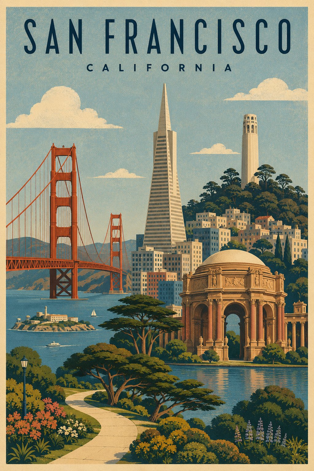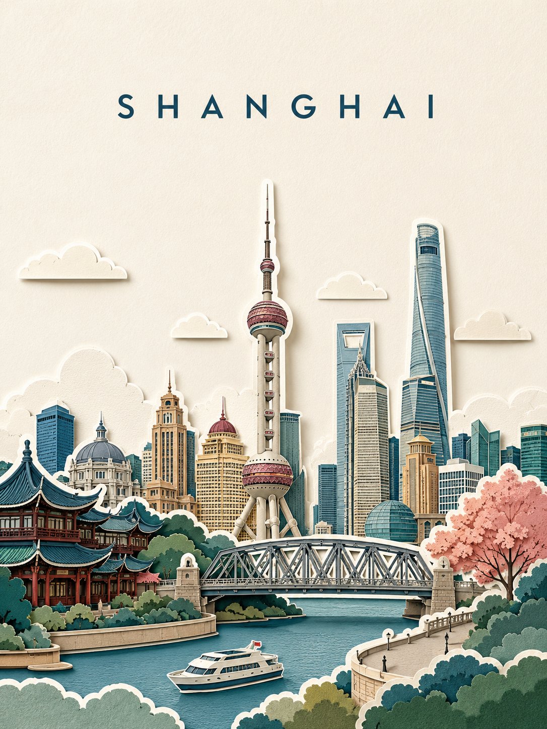


images · travel poster · city poster
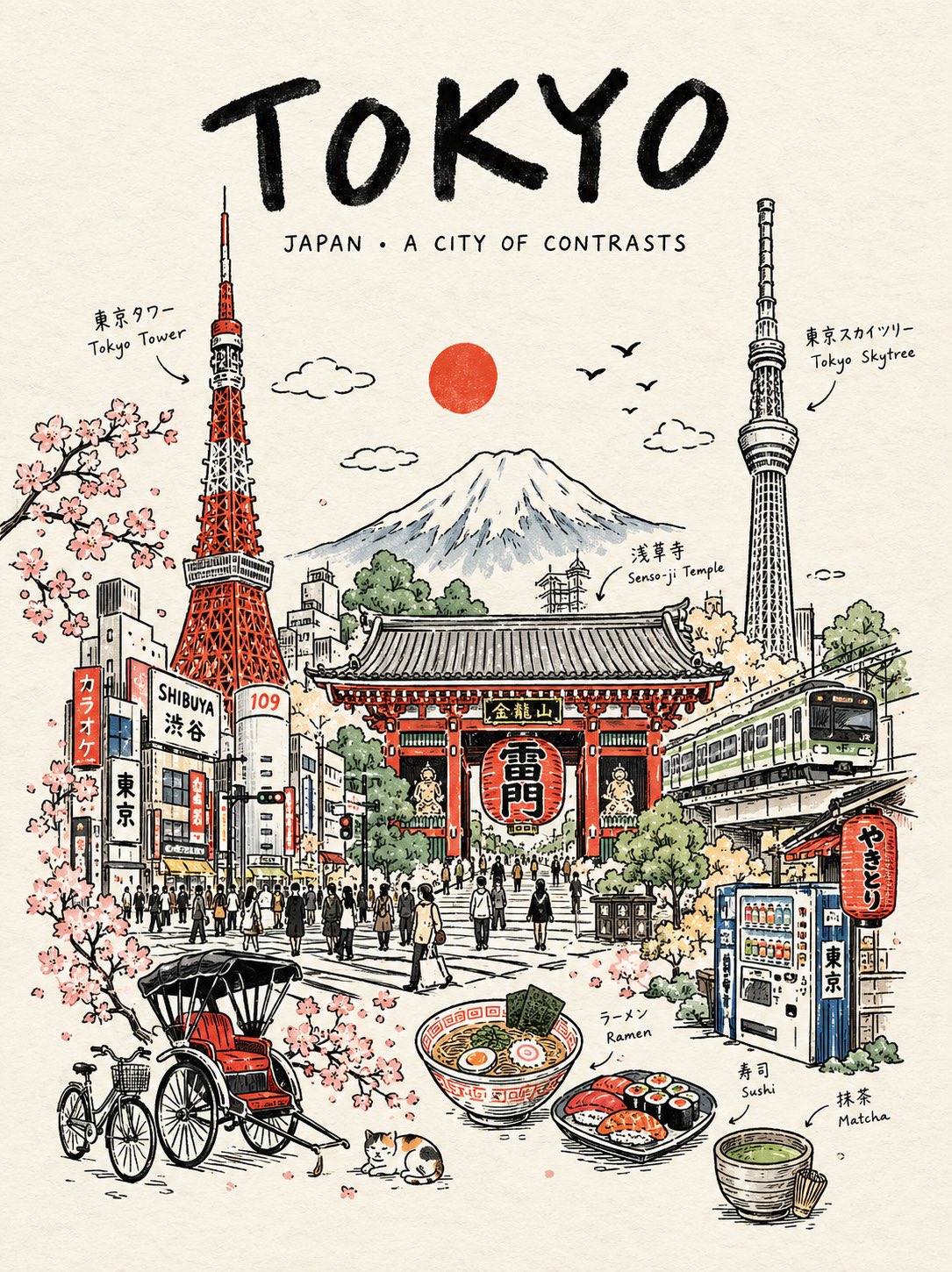
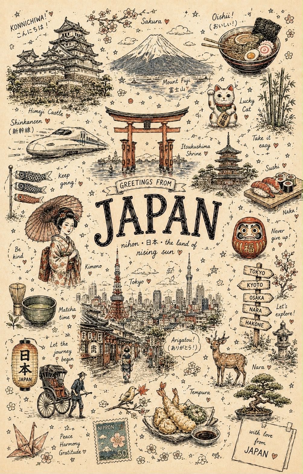
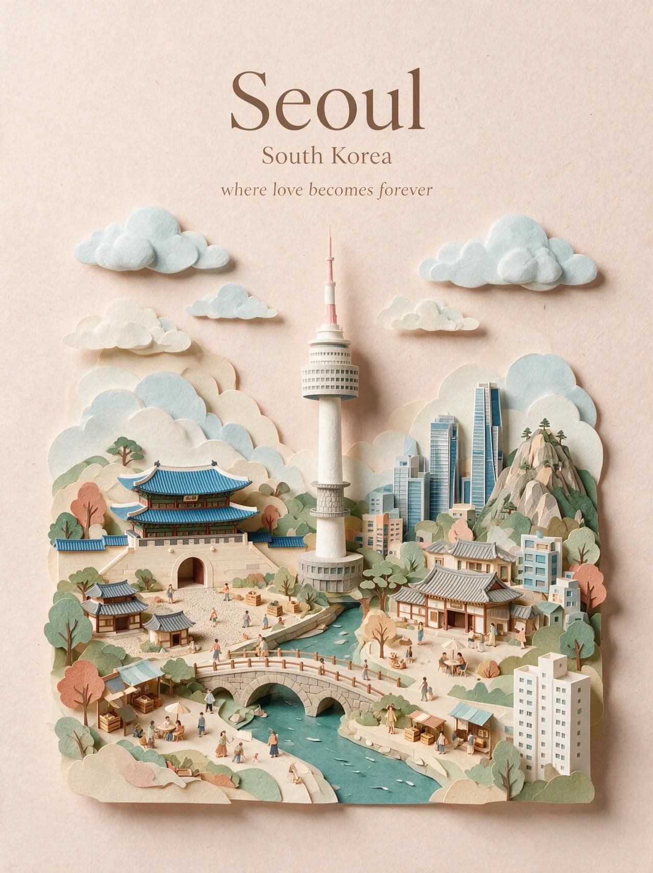
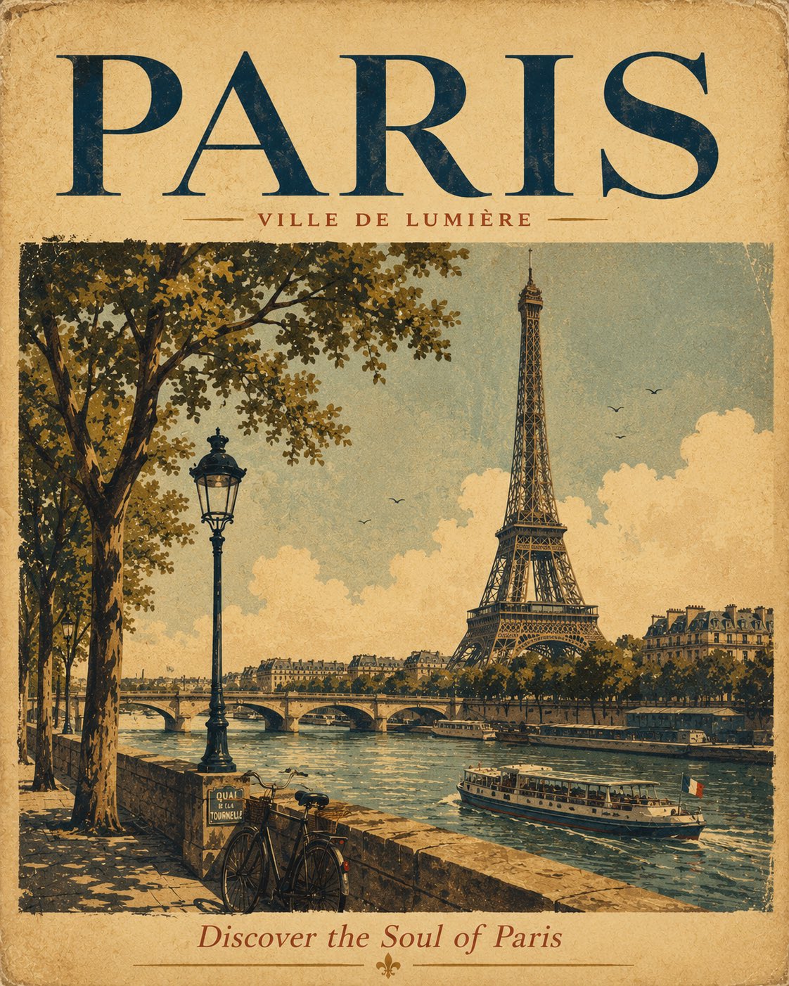
CITY = {CITY} Create a sophisticated vertical 3:4 travel poster of {CITY} as a premium layered papercut sticker illustration. Use only the city name as input. Identify its country, architecture, geography, visual identity, and 3–5 iconic landmarks genuinely located in {CITY}. Select 1–2 Hero Landmarks + 2–3 Secondary Landmarks based on recognizability, cultural importance, uniqueness, and strong association with the city. Never invent or borrow landmarks. Landmark accuracy: Preserve authentic silhouettes, proportions, rooflines, towers, domes, arches, bridges, façades, and defining structures. Keep approximately 70% landmark identity / 30% stylization. Composition: Vertical 3:4. Place the main cityscape in the lower 50–60%, leaving the upper 40–50% clean and spacious. Put only {CITY} at the upper center in uppercase sans-serif with wide letter spacing. No subtitle, slogan, labels, or extra text. Build one cohesive cityscape with authentic buildings, streets, water, hills, vegetation, clouds, bridges, and environmental elements appropriate to {CITY}. Papercut style: Handcrafted layered matte cardstock, clean simplified shapes, rounded cut edges, subtle paper thickness, visible fibers, slight imperfections, and soft contact shadows. Premium tactile paper artwork—not glossy CGI, plastic, photorealism, or heavy 3D. White sticker border: Mandatory thick white/ivory die-cut outline around major landmarks, buildings, bridges, vegetation, vehicles, landforms, and selected clouds. Keep it smooth, continuous, rounded, and approximately 2–4% of object width. Use subtle contact shadows. Do not heavily outline tiny details or title text. Color: Create a refined 6–10 color palette inspired by {CITY}. Use sophisticated muted tones such as dusty blue, teal, mint, coral, terracotta, warm sand, cream, off-white, and restrained dark accents. Adapt naturally to the city; avoid neon and excessive saturation. Style: Premium papercut illustration, layered cardstock collage, collectible travel sticker, Scandinavian editorial design, contemporary architectural poster, clean geometric simplification, museum-quality craftsmanship. Avoid: inaccurate landmarks, borrowed landmarks, generic skylines, extreme abstraction, disconnected stickers, inconsistent outlines, childish/kawaii styling, photorealism, glossy surfaces, heavy extrusion, dramatic shadows, excessive gradients, neon colors, vintage filters, overcrowding, micro-detail, and unnecessary text. FINAL: Create an elegant, recognizable {CITY} cityscape that reads instantly at thumbnail size, with authentic landmarks, cohesive layered paper construction, refined colors, and bold white die-cut borders.
Continue by camera language