

images · travel poster · destination artwork
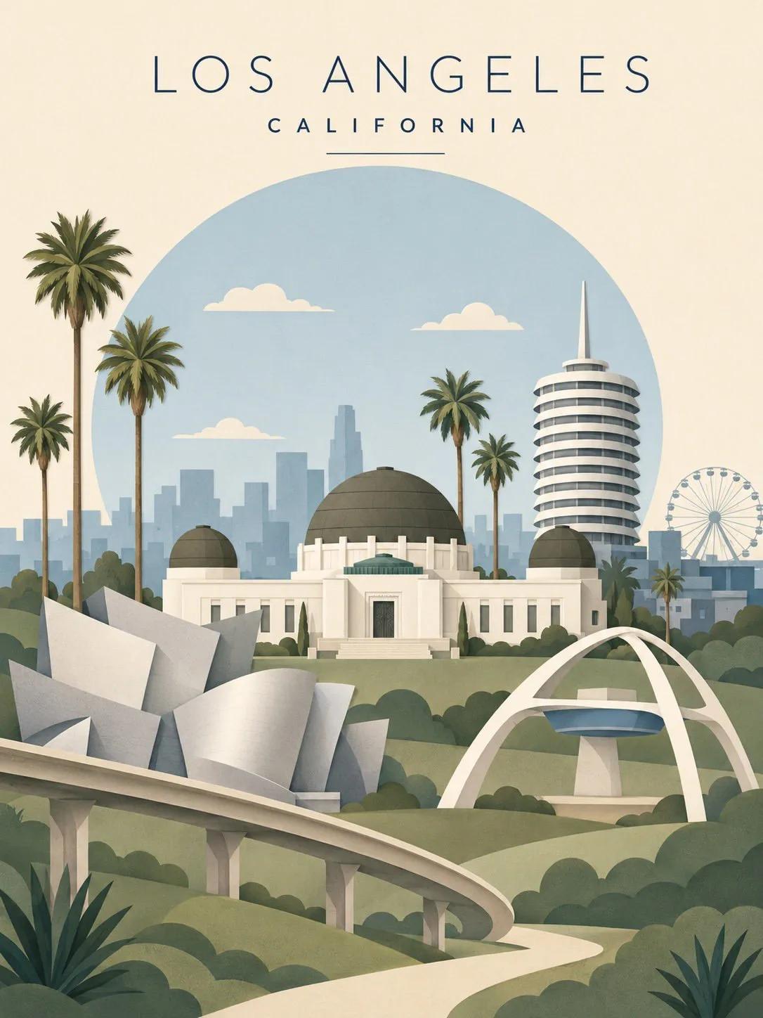
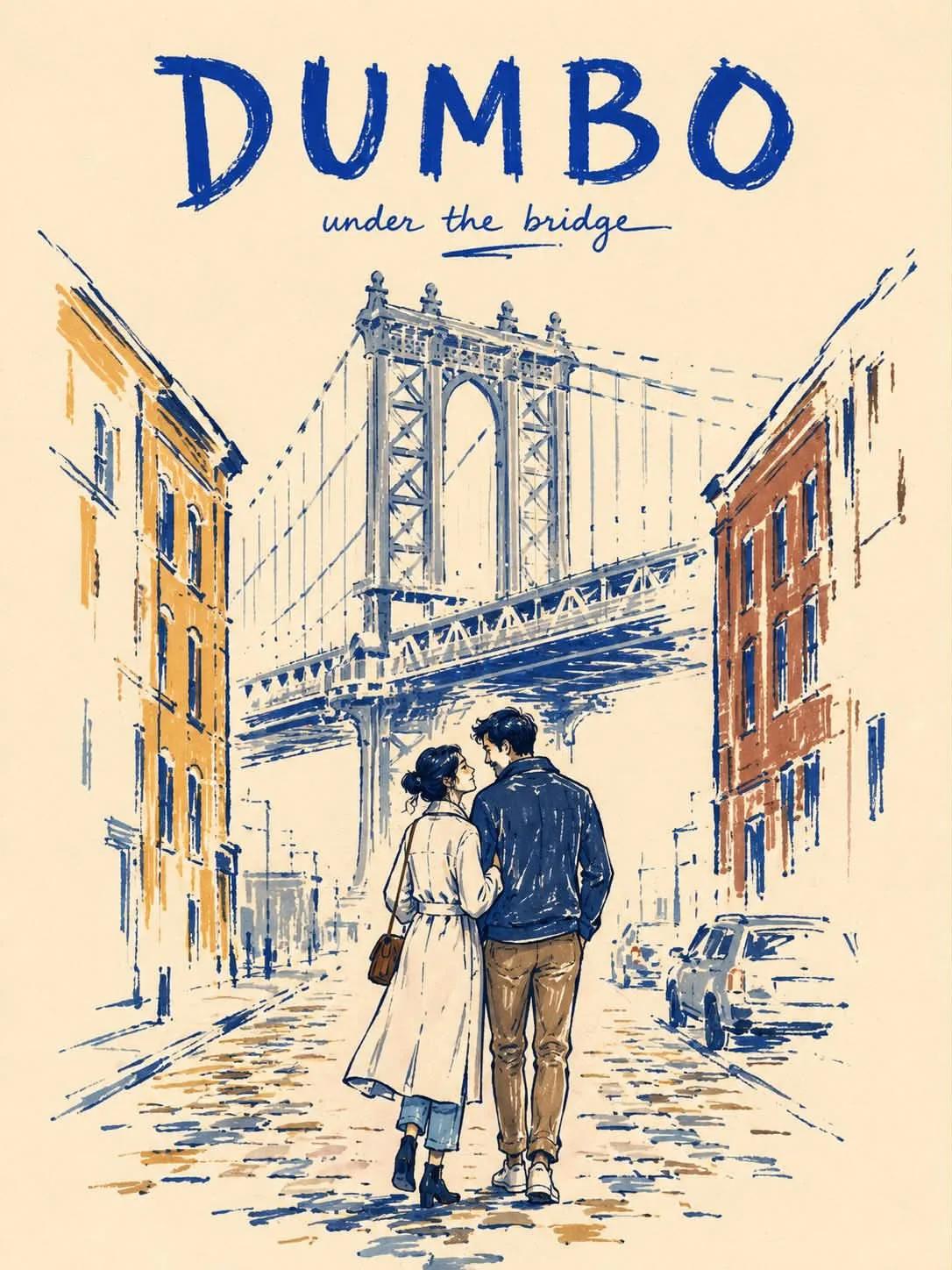
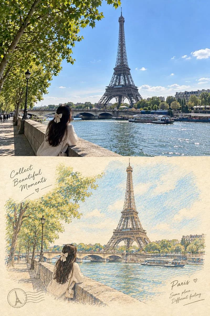
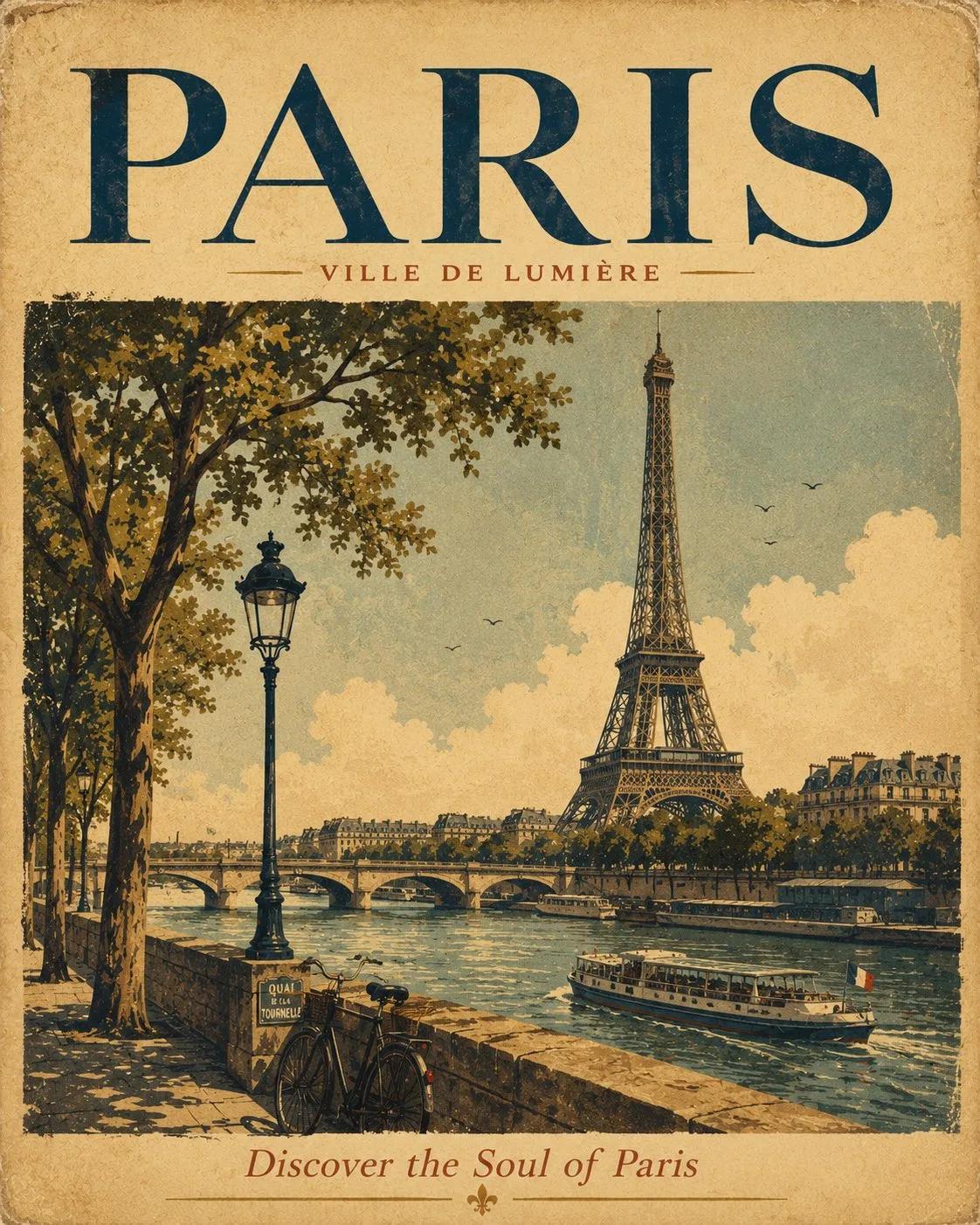
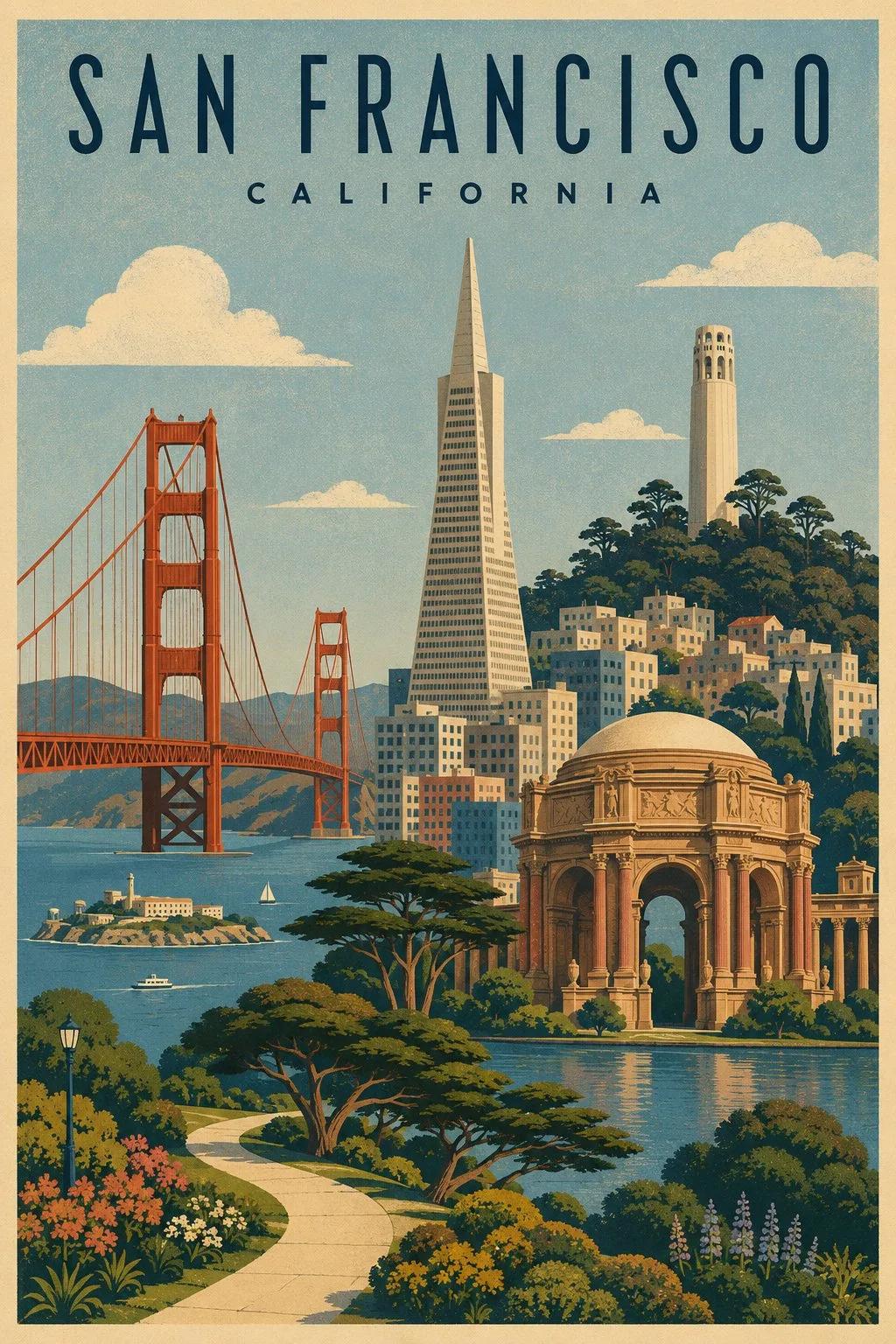
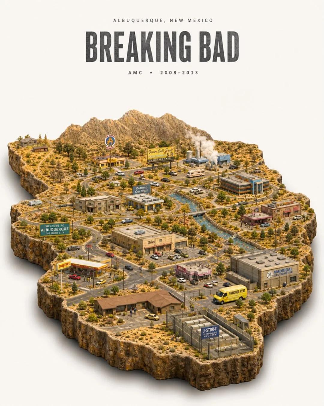
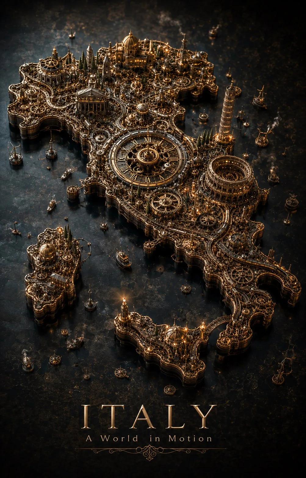
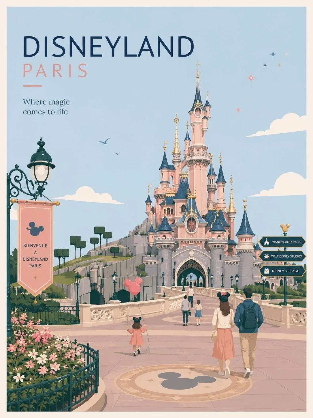
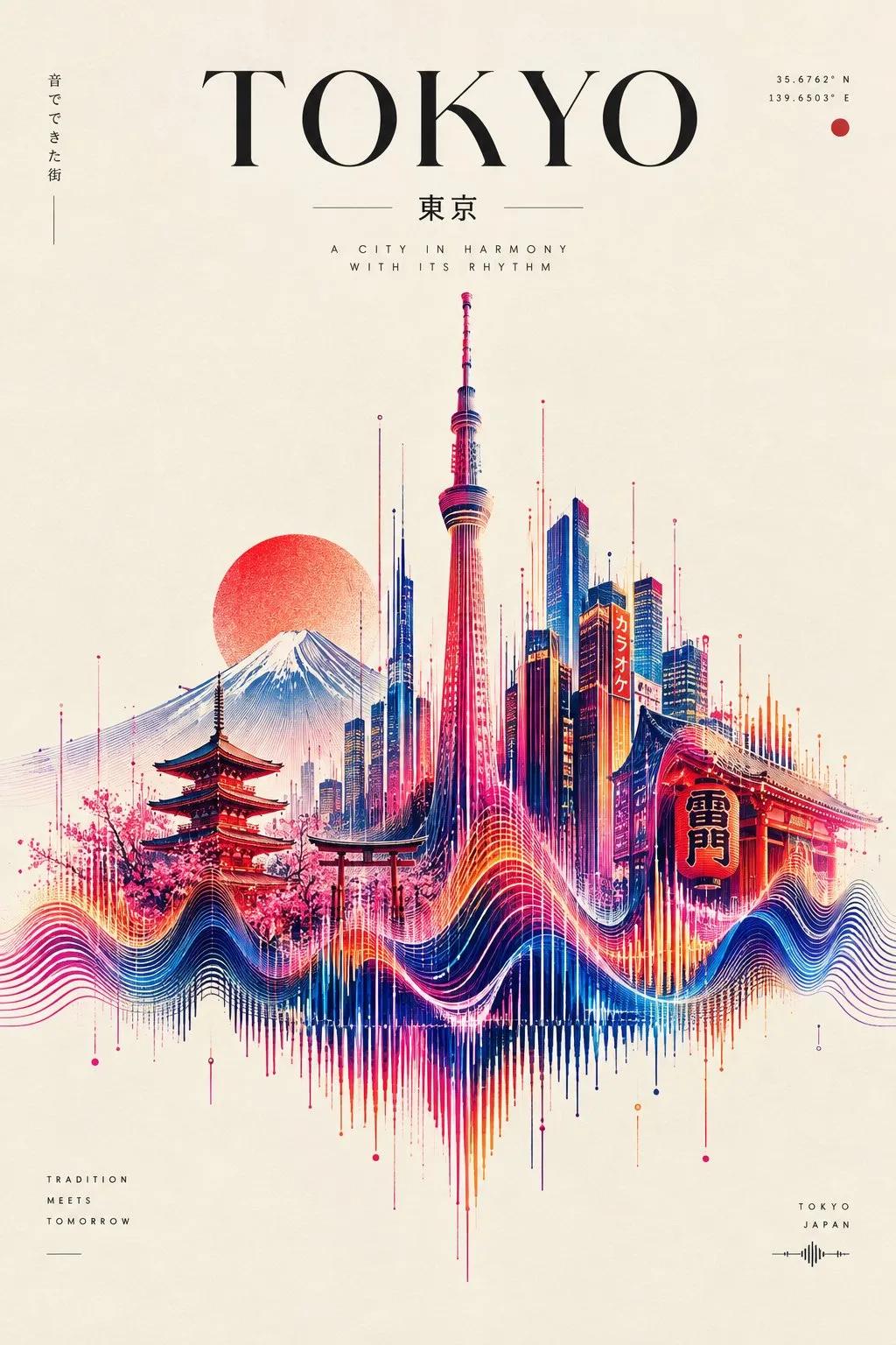
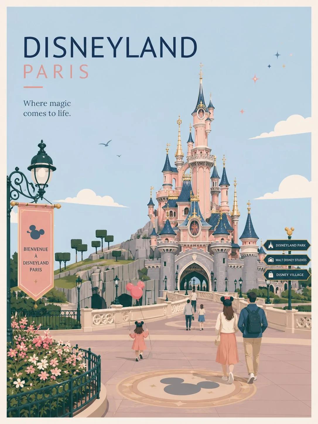
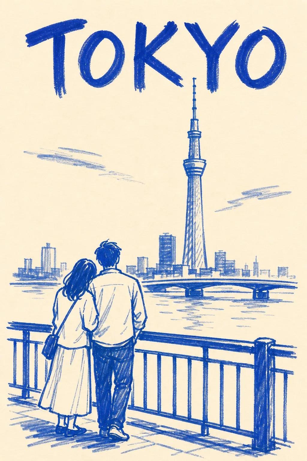
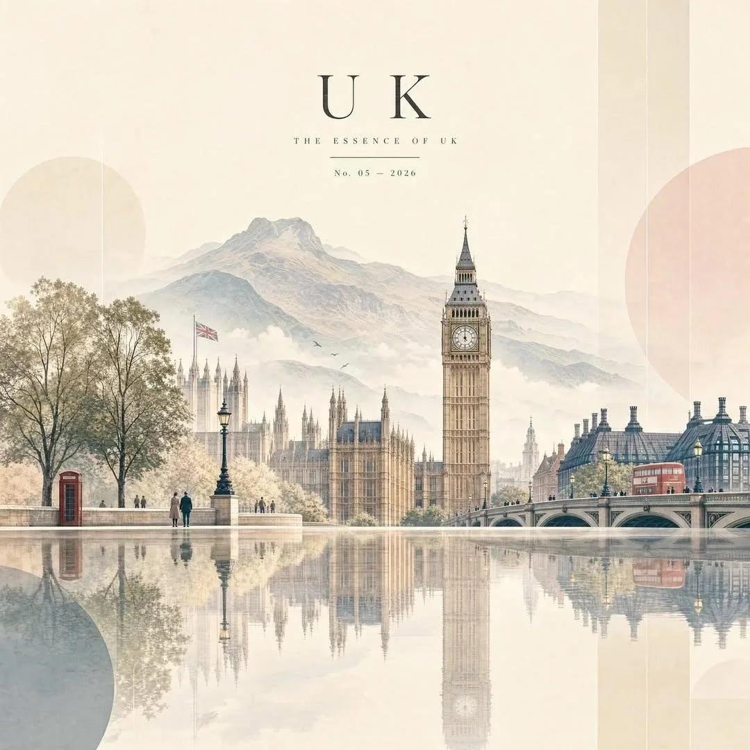
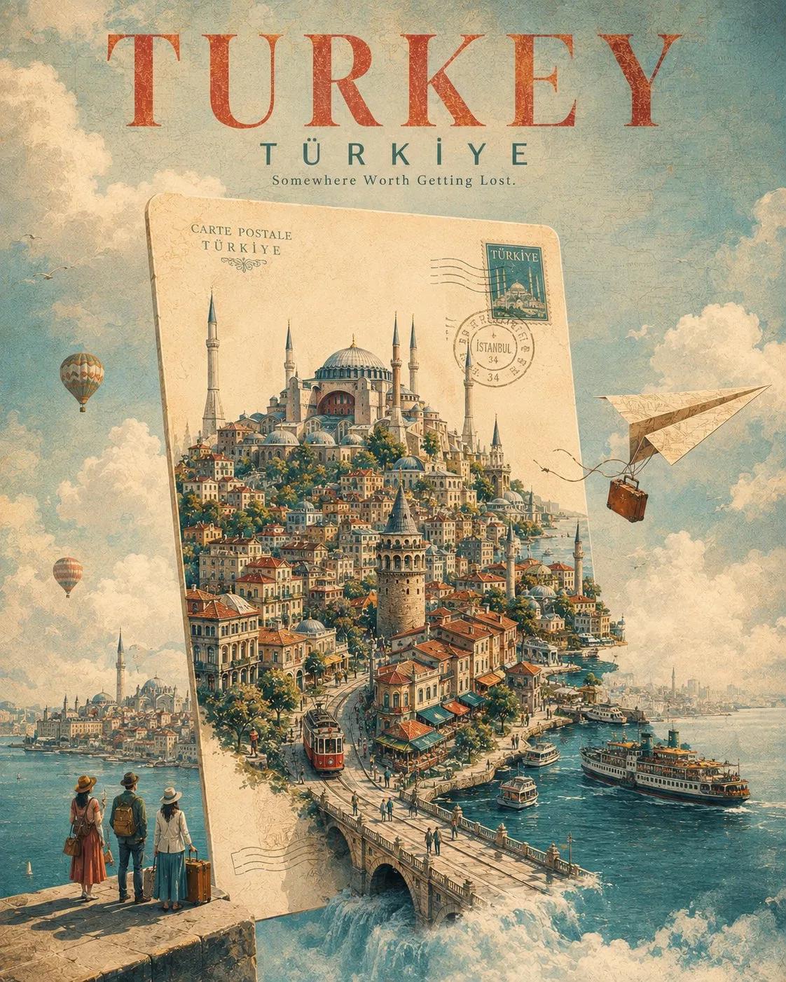
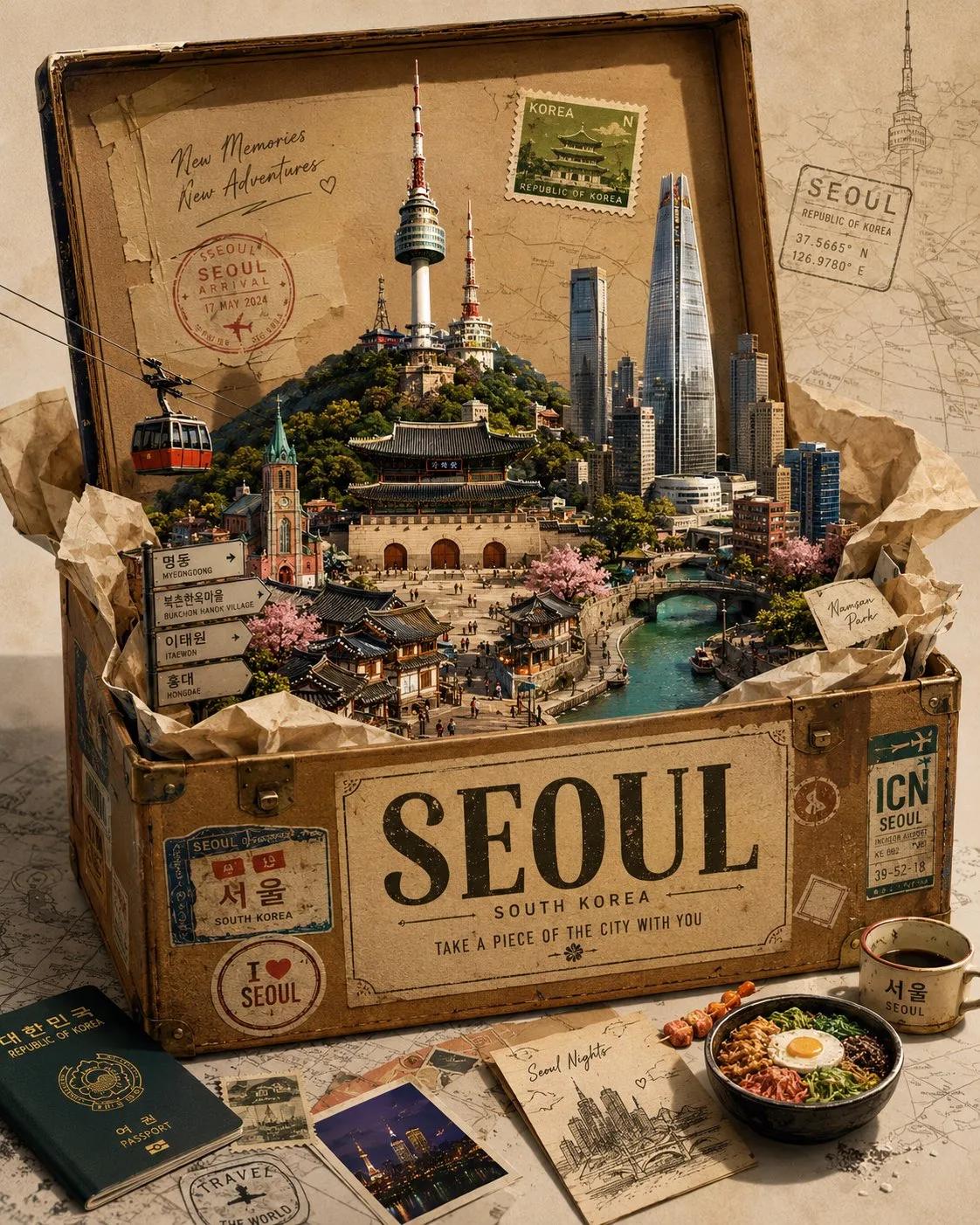
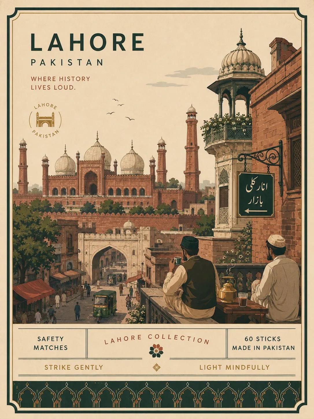
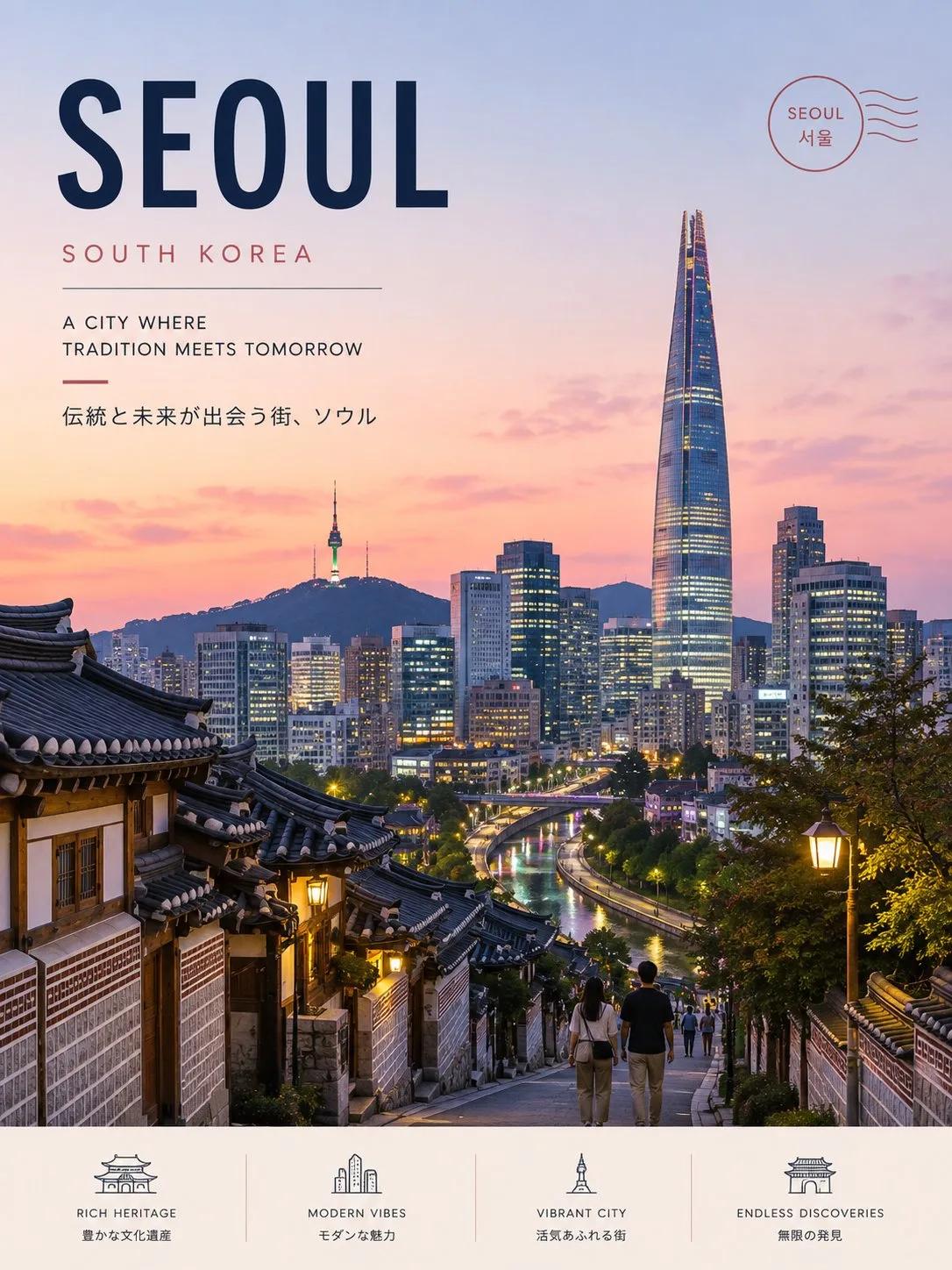
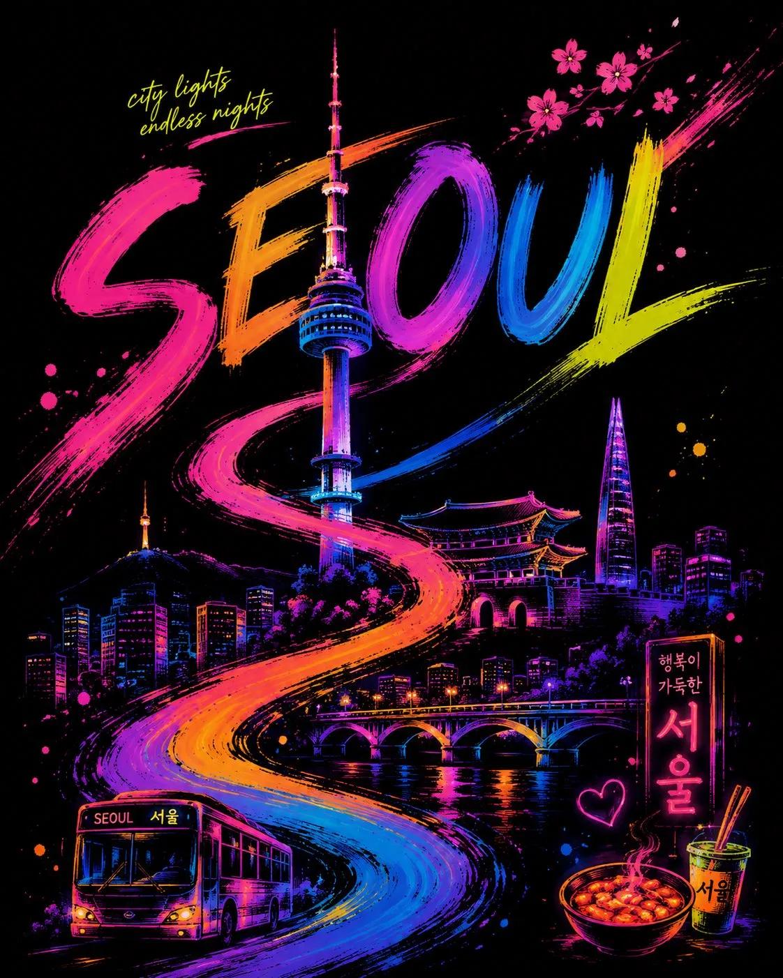
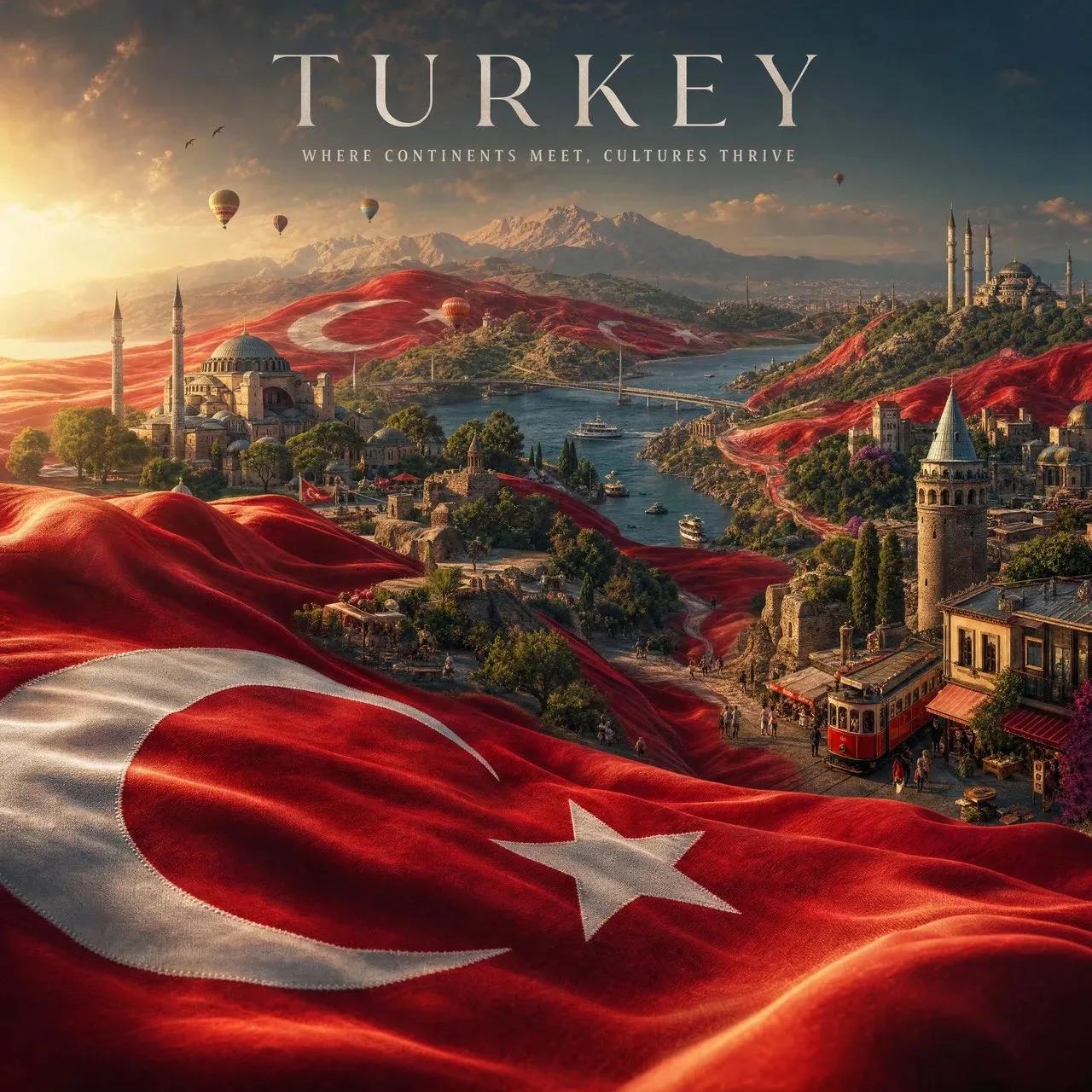
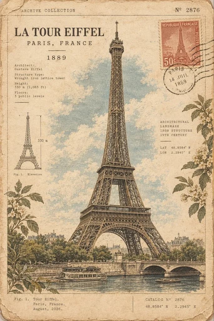
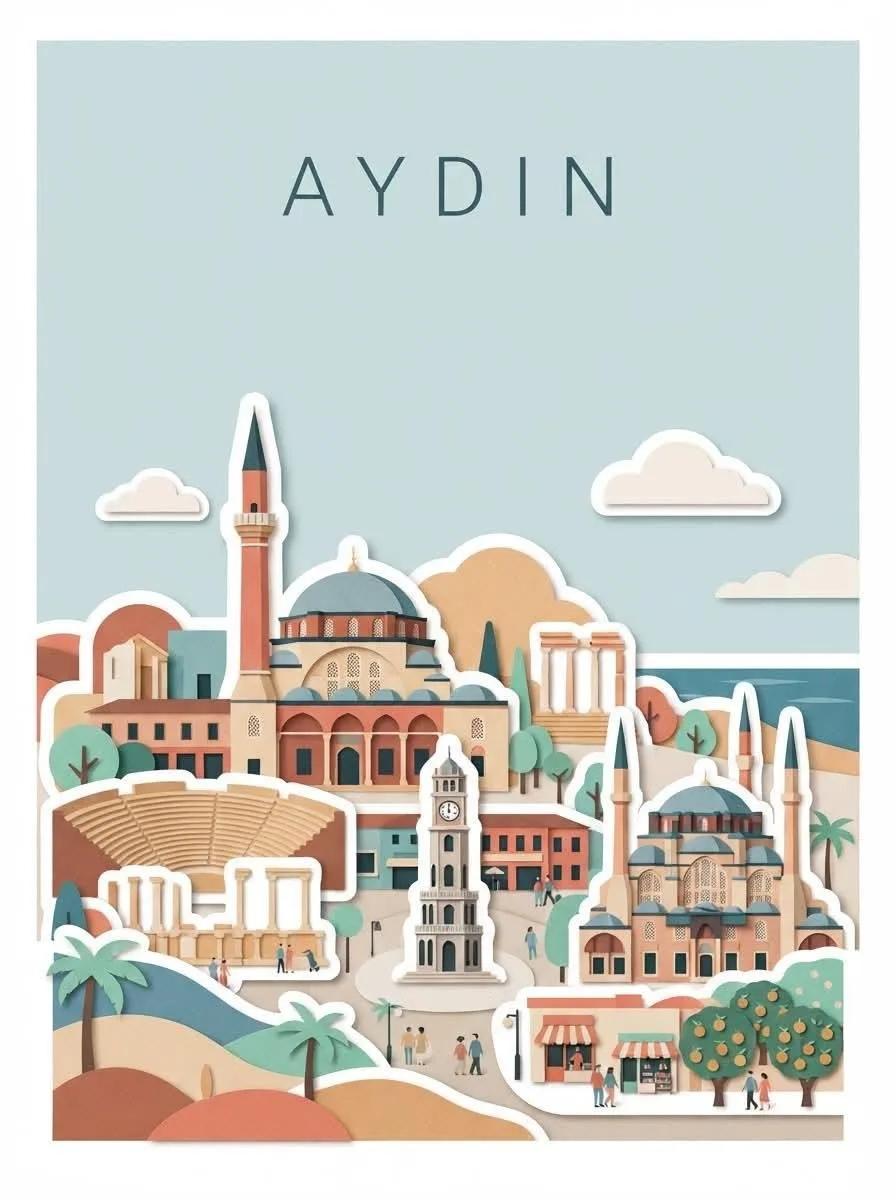
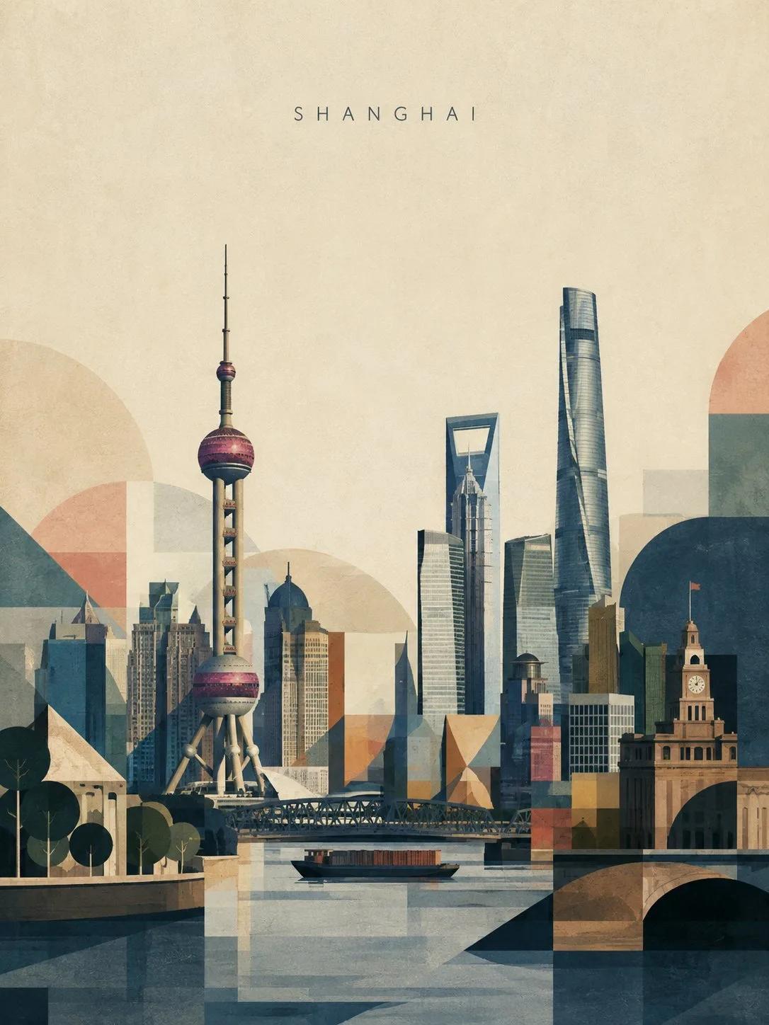
Create a sophisticated 3:4 vertical travel art poster of [DESTINATION]. Make the destination immediately recognizable through 3–5 authentic iconic landmarks, with the 1–2 most recognizable landmarks as the dominant focal points. Preserve their real silhouettes, proportions, and defining architectural features. Core balance: 70% recognizable landmark/cityscape + 30% geometric abstraction. Use restrained circles, arches, rectangles, triangles, stepped forms, and color blocks only to simplify surrounding buildings, roads, rivers, hills, trees, and negative space. Never let abstraction overpower or obscure the landmarks. Keep the upper 40–50% spacious with clean sky/negative space. Place only [DESTINATION] at the upper center in small, elegant uppercase thin sans-serif typography with wide letter spacing. No other text. Use a sophisticated 6–10 color palette inspired by the destination, with muted contemporary tones rather than neon or overly saturated colors. Add subtle gouache, colored-pencil, paper-fiber, and silkscreen texture for a handmade fine-art feel. Style: contemporary travel poster + Scandinavian editorial illustration + mid-century geometric art + modern architectural fine-art print. Avoid photorealism, excessive abstraction, giant geometric shapes, generic cityscapes, cartoon/3D styling, neon colors, heavy gradients, vintage/sepia effects, yellowed paper, and excessive detail. Final goal: instantly recognizable as [DESTINATION], yet sophisticated enough to feel like a collectible contemporary museum-shop artwork.
Related prompts